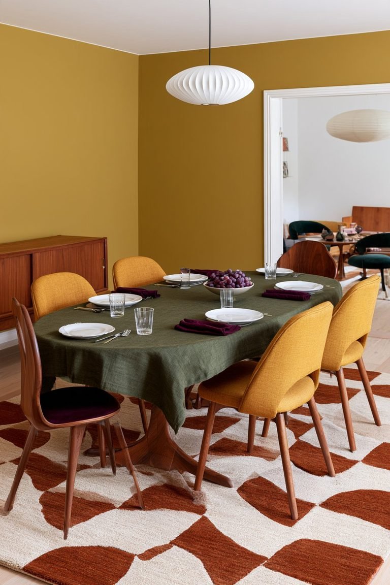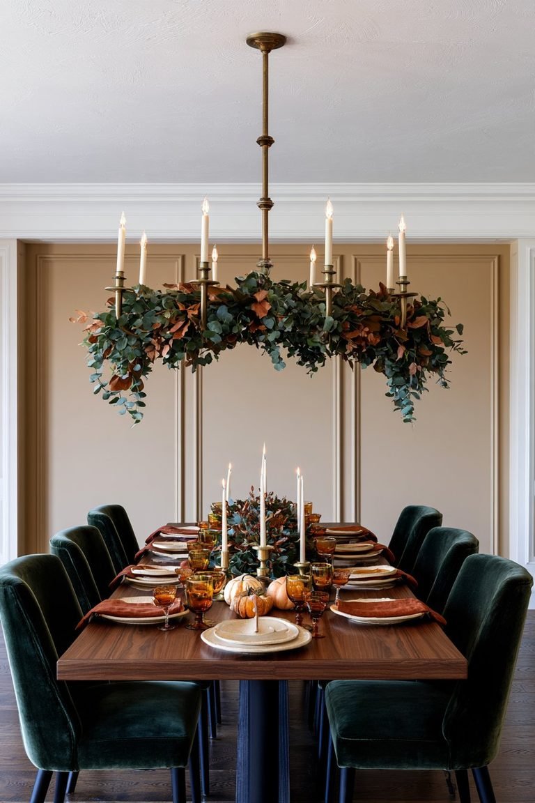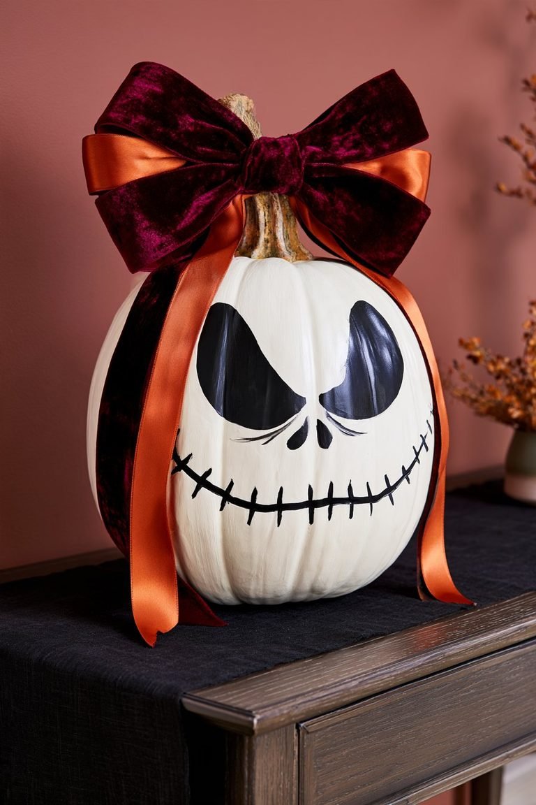
Blue and orange fall dining table decor pairs the cool tones of the season’s evening skies with the warmth of turning leaves, creating a look that feels both fresh and familiar. The combination works because blue and orange sit opposite each other on the color wheel, giving any tablescape a natural sense of balance rather than clash.
From layered linens and mixed dinnerware to pumpkin centerpieces and warm lighting, there are dozens of ways to bring the palette to a dining table without it feeling overdone. The ideas below focus on practical, easy-to-execute touches: pieces that can be thrifted, DIY’d, or picked up without a full table overhaul. Whether the goal is a farmhouse-leaning table or something closer to modern and polished, these ideas can be mixed and matched to fit the space.
Start With a Complementary Blue and Orange Base
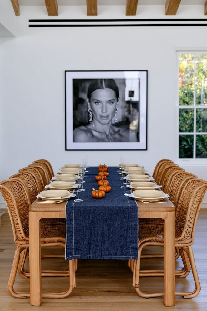
Blue and orange sit opposite each other on the color wheel, which is what makes the pairing feel balanced rather than clashing. Choosing one color as the dominant base and the other as an accent, rather than splitting the table evenly, can keep the look cohesive and easy to build on.
Lead With Burnt Orange, Not Bright Orange
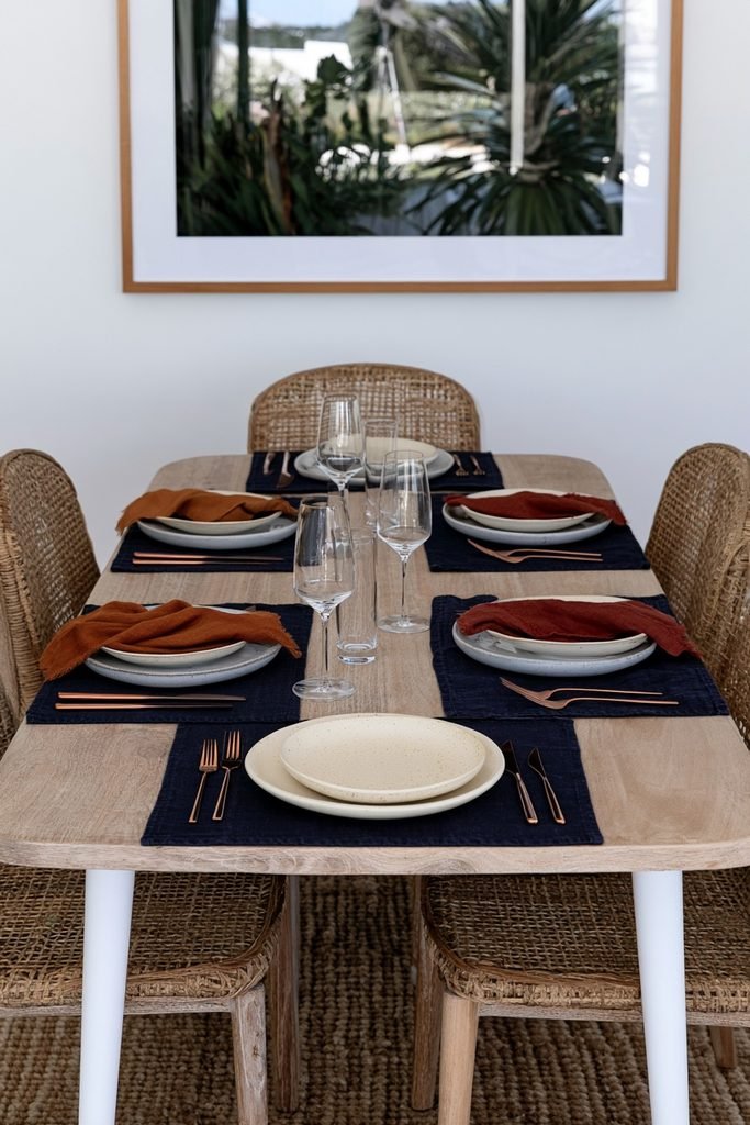
Softer, warmer shades of orange tend to read as more seasonal on a fall table than pure orange does. Rust, terracotta, and copper tones can pair naturally with navy or dusty blue linens without competing for attention.
Layer On a Table Runner
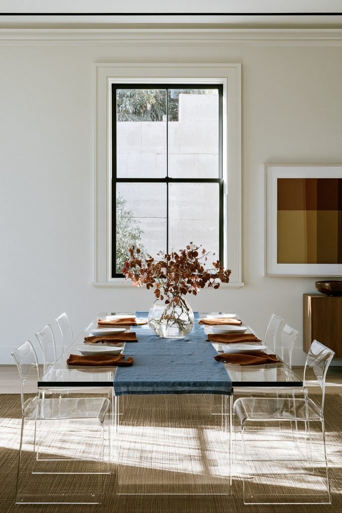
A table runner is often the easiest starting point for this palette, since it introduces color without committing to a full tablecloth swap. A dusty blue linen runner can act as a simple foundation, with orange napkins or a centerpiece layered on top for contrast.
Mix Two Linen Layers
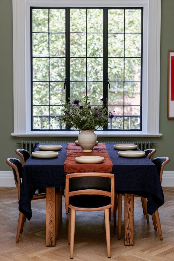
Combining a smaller tablecloth with a runner on top can add depth and let a wood table surface peek through at the edges. This layering approach gives the eye more to take in than a single flat cloth.
Try a Navy Tablecloth as the Anchor
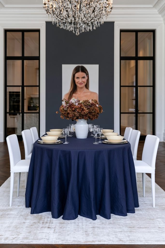
A deep navy tablecloth can ground the table and give orange accents somewhere to stand out. Cream-colored china and a sleek charger plate can offer contrast against navy and keep the setting from feeling too dark, a pairing Saffron Marigold uses in its blue fall table styling.
Choose Chinoiserie Dinnerware
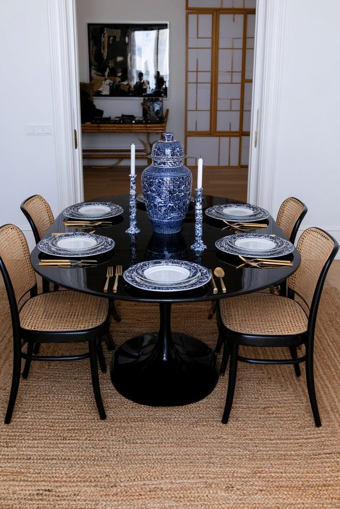
Blue and white chinoiserie plates, vases, and candle holders bring pattern into the mix without introducing a third competing color. Pairing gold or brass flatware with chinoiserie dishes can round out the look and give it a more traditional feel.
Pair Navy Plates With Copper Chargers
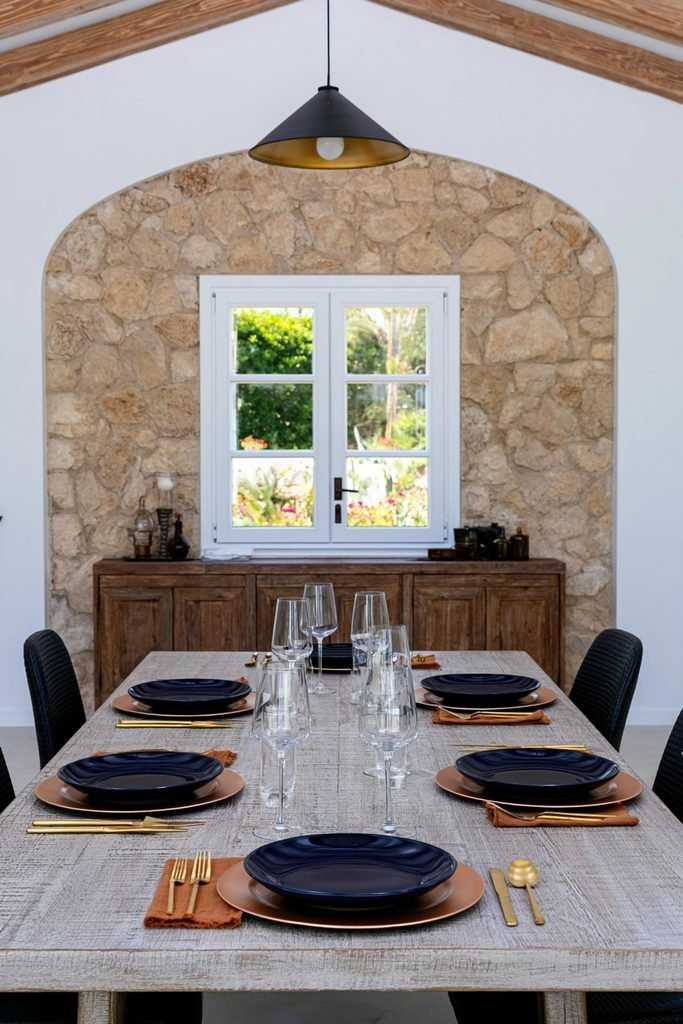
Copper chargers can warm up navy or blue dinner plates and pick up the orange side of the palette without needing an actual orange plate. Gold flatware works as a swap for the same effect if copper isn’t on hand.
Mix Wood and Metal Chargers
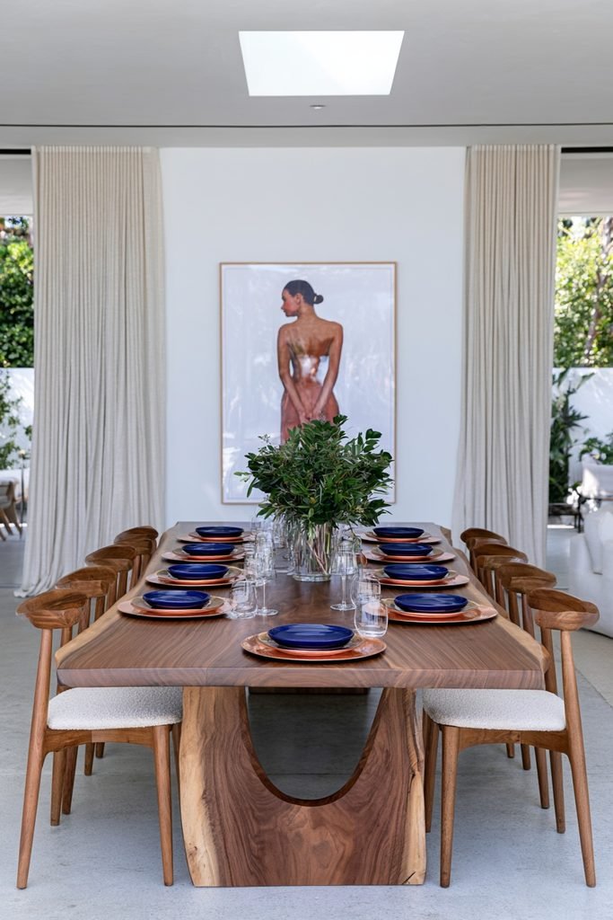
Wood chargers can add a farmhouse note underneath blue dinnerware, while a metal charger in copper or gold leans more polished. Either option can sit under the same set of blue plates depending on how formal the table needs to feel.
Use White Pumpkins as a Neutral Anchor
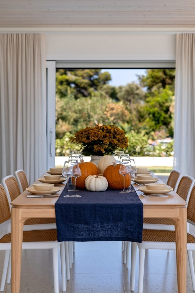
White pumpkins scattered among orange ones can keep the tablescape from feeling too saturated. They also give the eye a resting point between the blue linens and the orange accents.
Add Velvet Pumpkins in Both Colors
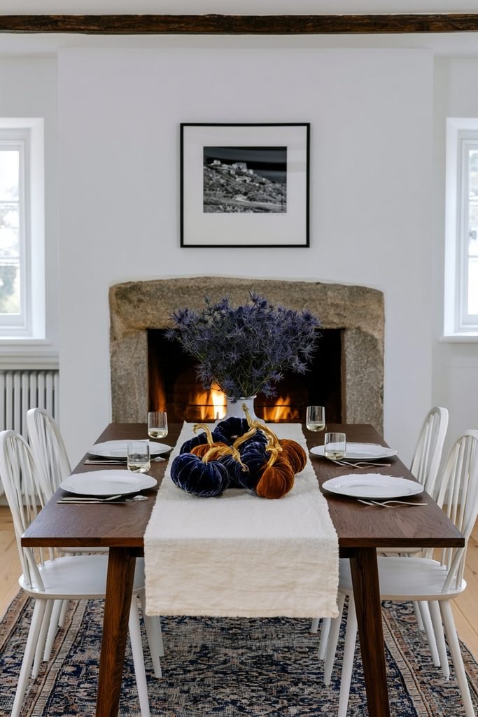
Velvet pumpkins in both dusty blue and burnt orange can be mixed directly into a centerpiece for texture. Gold-stemmed versions add a bit of shine without introducing a new material.
Try Painted Blue Pumpkins
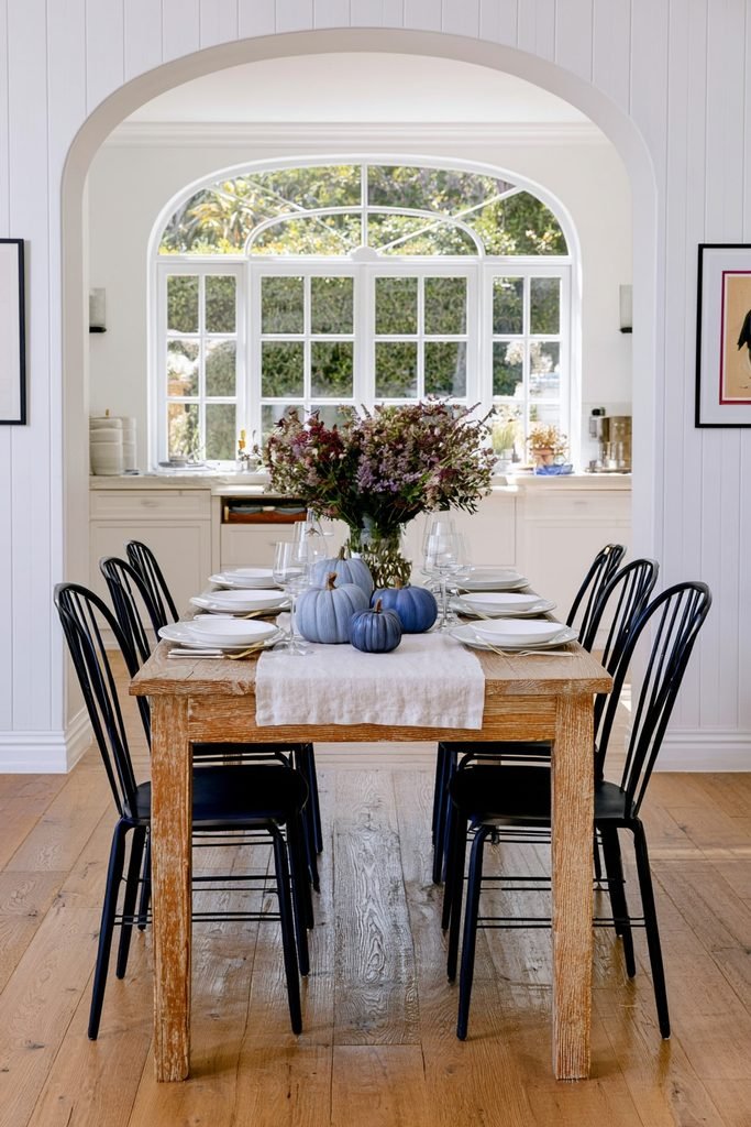
Plain faux pumpkins can be painted in shades of dusty blue, powder blue, or slate to fit the palette exactly, an approach The Garden Style highlights in its blue and orange fall roundup. This works well when a matching blue pumpkin can’t be found in stores.
Style a Dough Bowl Centerpiece
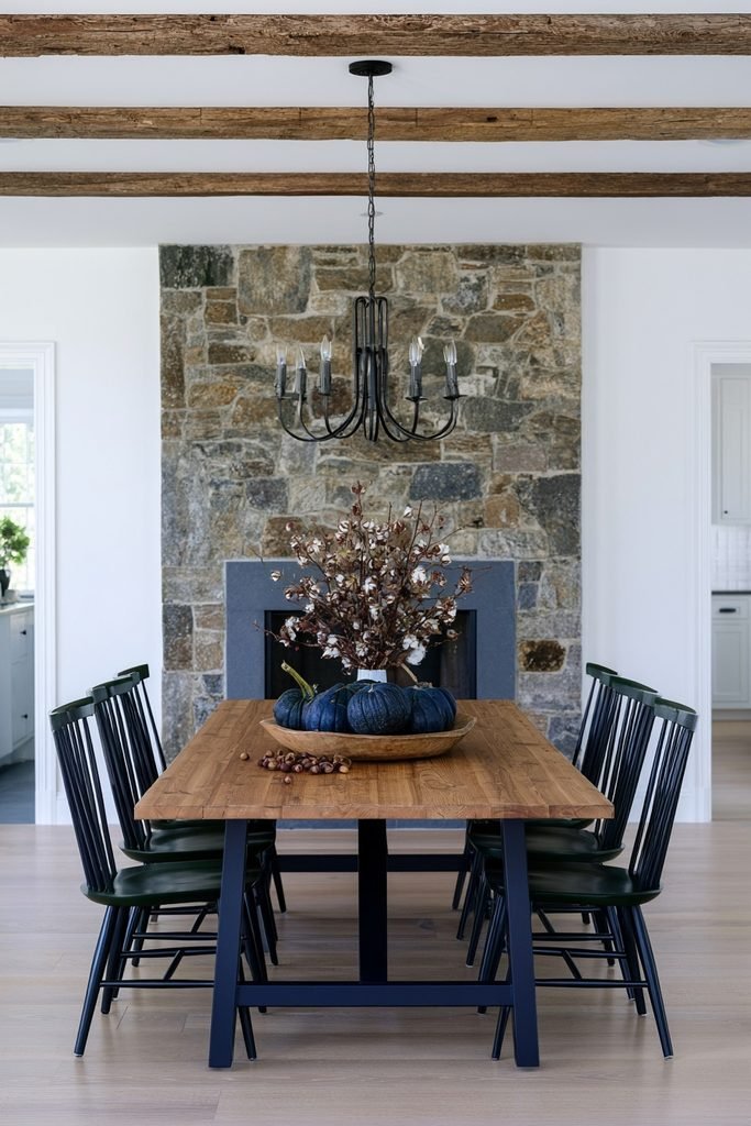
A wooden dough bowl filled with a mix of blue pumpkins, dried cotton stems, and scattered acorns makes for a low, wide centerpiece that doesn’t block sightlines across the table, another idea from The Garden Style. This style works especially well on a farmhouse table.
Build a Cornucopia Centerpiece
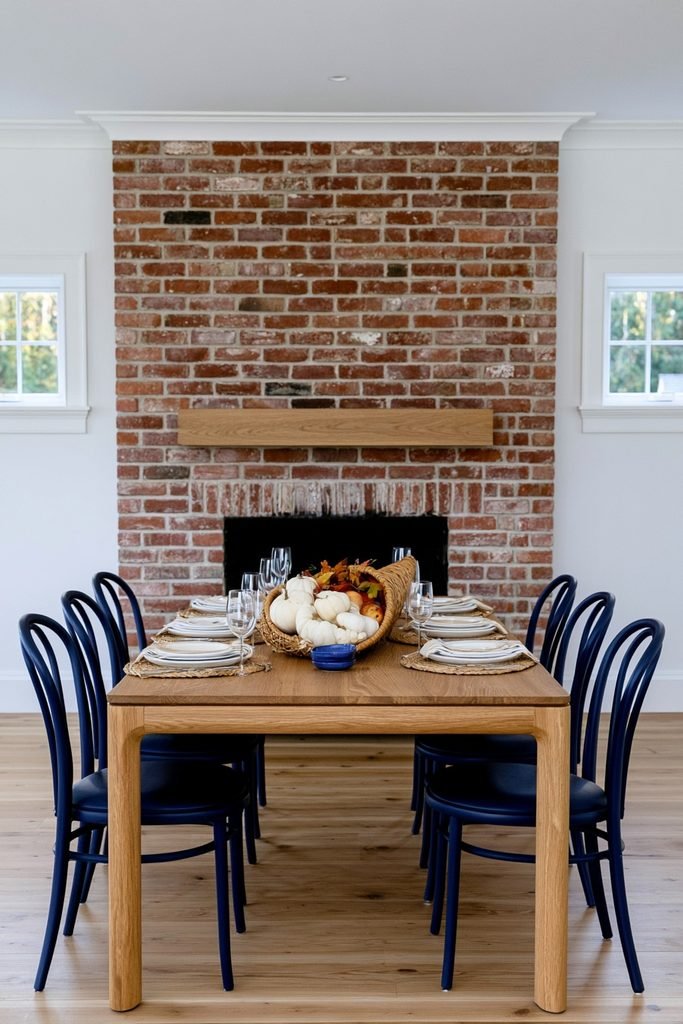
A cornucopia basket filled with white pumpkins, fresh fruit, and fall leaves can give the table a classic harvest look, a styling choice WM Design House uses on its blue and orange Thanksgiving table. Adding a few blue accents nearby keeps it from reading as purely traditional.
Use a Pumpkin as a Vase
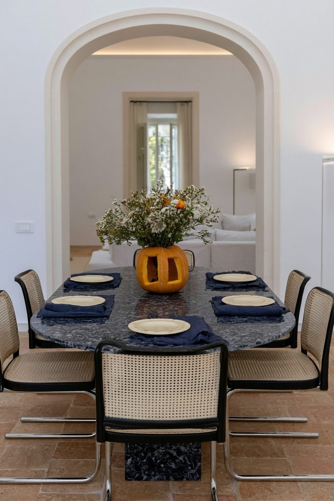
A fresh or faux pumpkin, hollowed out and used as a vase — a technique also shown by WM Design House — turns the centerpiece into a two-in-one piece rather than requiring a separate vase and pumpkin display. Orange or white blooms in the pumpkin can keep the focus on the seasonal shape.
Arrange Blue and Orange Florals
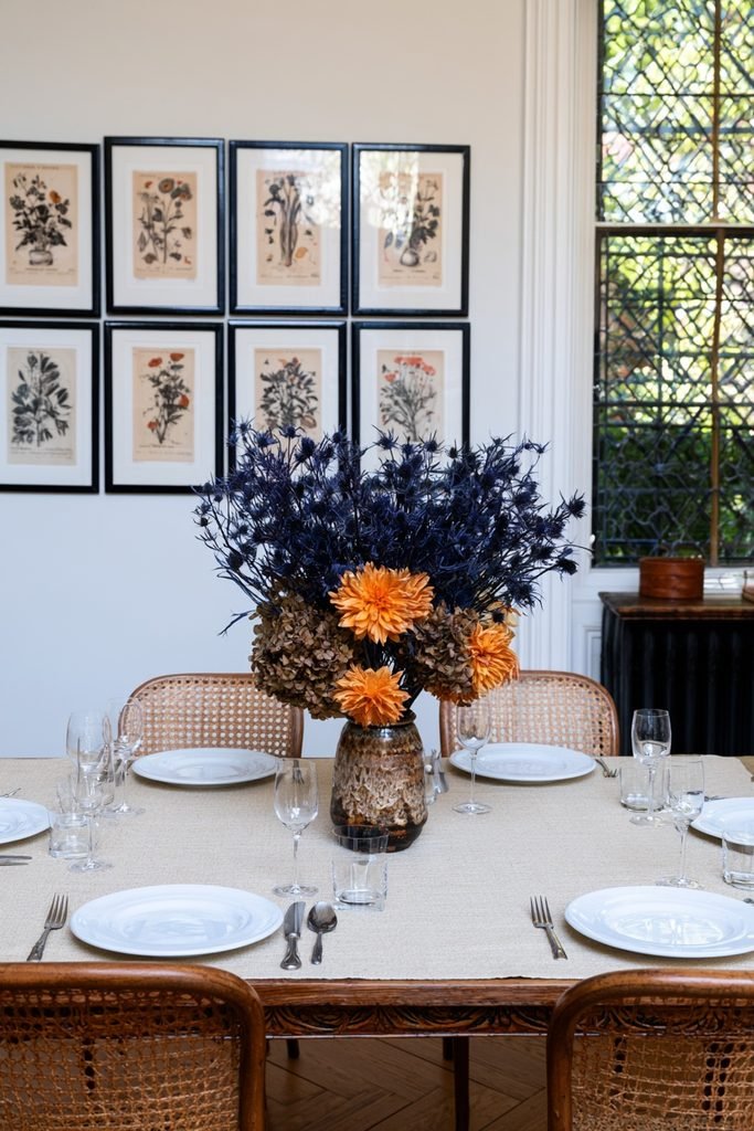
A bouquet mixing orange dahlias with blue thistles or hydrangeas brings both colors into a single arrangement rather than keeping them separate. Faded or dried blooms tend to read as more fall-appropriate than fresh, bright flowers.
Add Dried Botanicals for Texture
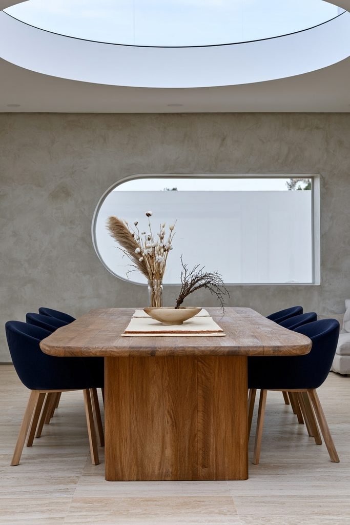
Dried cotton stems, pampas grass, and preserved branches can add texture to a centerpiece without adding more color. They also hold up through the whole season without wilting, which makes them practical for a table that stays set for weeks.
Choose Brass Candlesticks
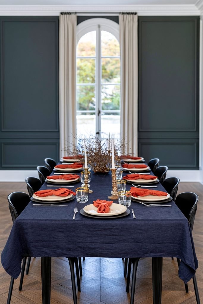
Brass candlesticks or a small brass tray can brighten a navy-heavy table, since brass reflects light in a way that softens darker blue tones, a pairing Brocante Ma Jolie points to when styling navy fall decor. A pair of aged brass candlesticks works well flanking a low centerpiece.
Add Amber Glass Votives
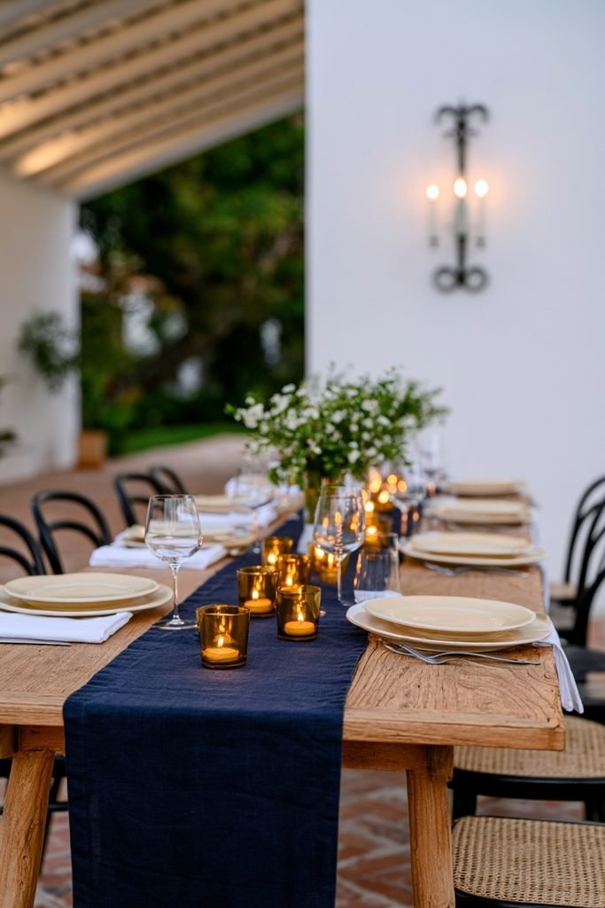
Amber or copper-toned glass votives pick up the orange side of the palette in small, low-commitment doses. Scattering several down the length of the table can add warm light without competing with a taller centerpiece.
Try Copper Fairy Lights
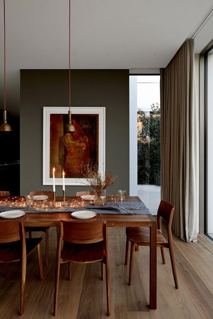
Battery-operated copper fairy lights, tucked into a centerpiece or wound along a runner, can add a soft glow after dark, a styling tip from Omnihomeideas. This works particularly well for evening dinners where overhead lighting stays dim.
Keep the Blue and Orange Palette Balanced
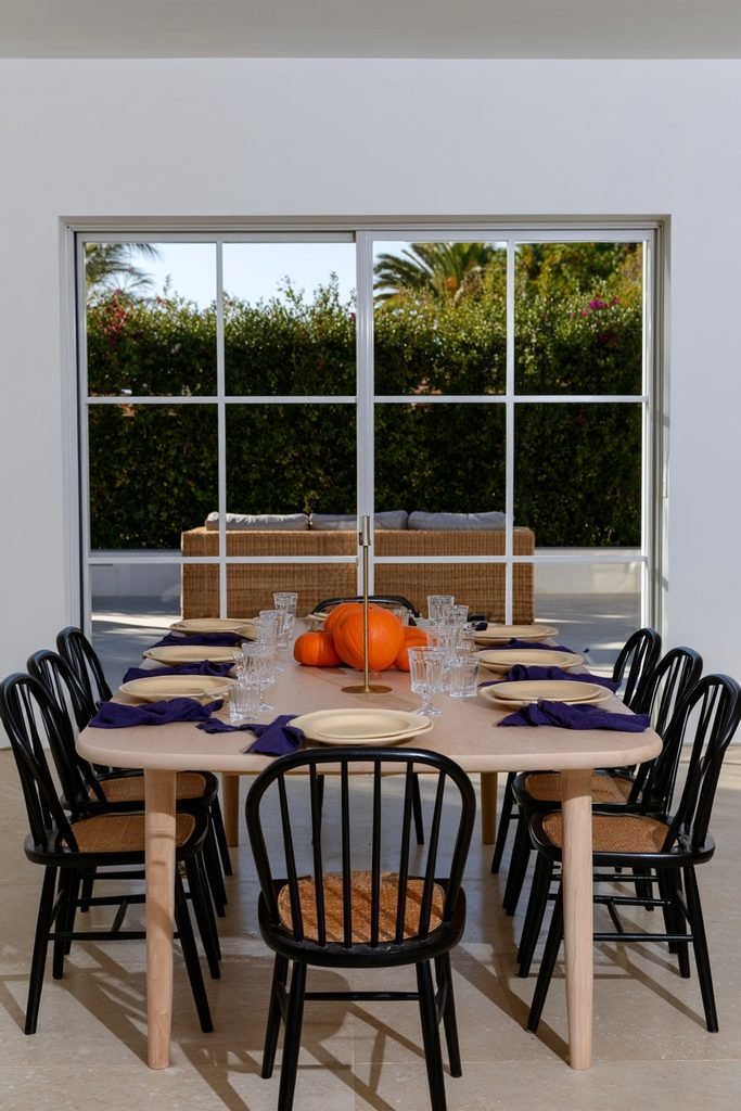
Repeating the accent color sparingly — a few orange pumpkins next to blue napkins, cream plates, and a brass candleholder — tends to read as more intentional than matching every element to the palette, a principle Brocante Ma Jolie points to in its blue fall decor guide. The table doesn’t need blue pumpkins, blue plates, and blue glasses all at once to feel coordinated.
Add Gold Flatware for Warmth
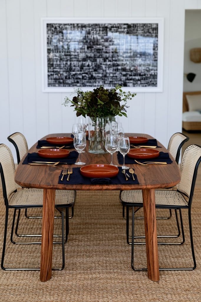
Gold or gold-dipped flatware can bridge blue and orange by picking up warmth from both metallics already on the table. It pairs equally well with chinoiserie dishes or a simpler, more modern place setting.
Set a Single Pumpkin at Each Place Setting
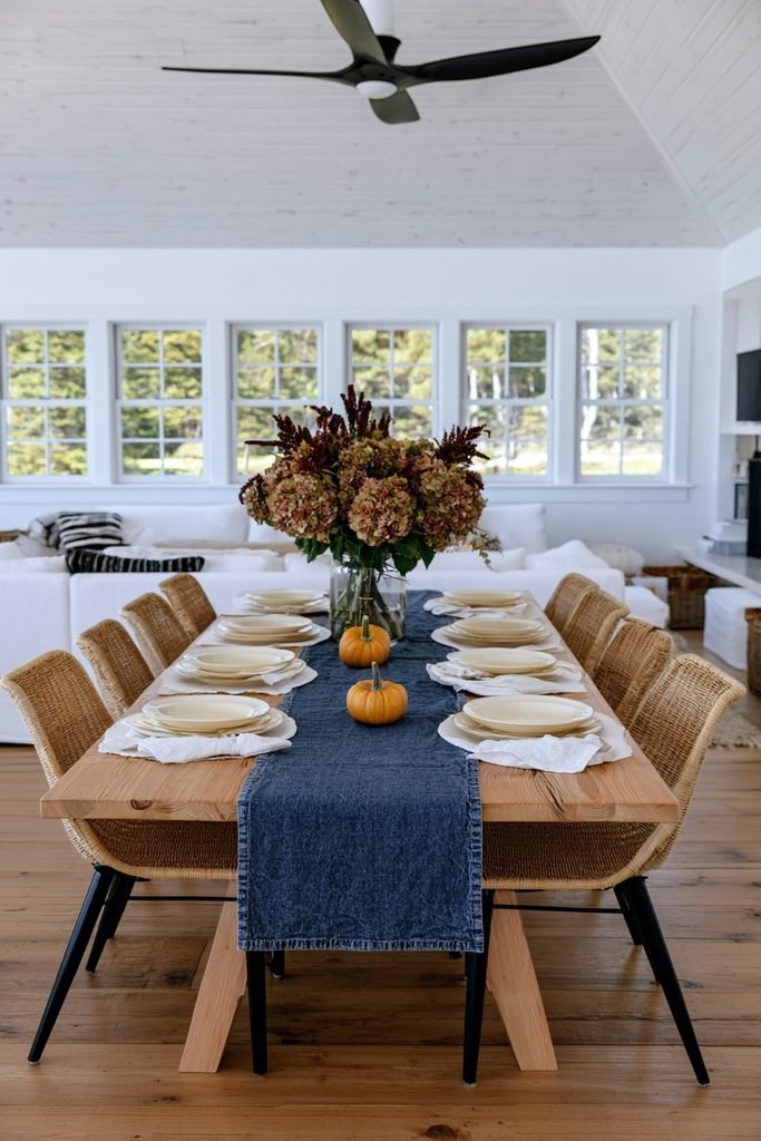
Placing one small pumpkin directly at each guest’s place setting is a simple way to bring the season into a table that otherwise stays simply set. The pumpkin can be moved aside once the meal starts, which keeps the table functional for a large gathering.
Add Acorns and Pampas Grass
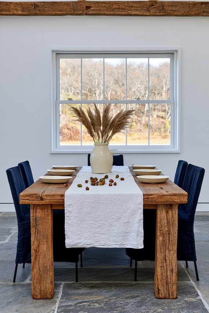
Scattering acorns and a few stems of pampas grass around a centerpiece can fill in gaps without adding cost or clutter. Both elements read as neutral, so they support the blue and orange palette rather than competing with it.
Keep It Budget-Friendly With Thrifted Pieces
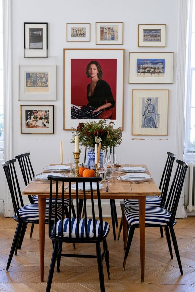
Thrifted vases, mismatched pumpkins, and secondhand candle holders can be pulled into the palette with a coat of paint or left as-is if the colors already fit. This approach keeps the look collected rather than perfectly matched, which suits the palette’s naturally eclectic feel.
Add Blue and White Napkin Rings
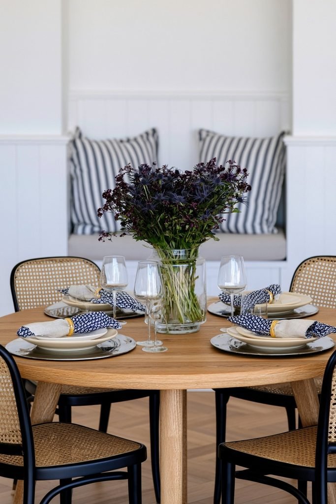
Napkin rings in a blue-and-white pattern, paired with a gilded finish — a combination Saffron Marigold uses alongside cream china and a sleek charger — add a small design detail that ties the place settings back to the dinnerware. This is an easy way to add pattern without introducing new furniture or linens.
Frequently Asked Questions
Does blue and orange work for Thanksgiving, or is it better suited to general fall decor?
The palette works for both. A version leaning more orange with small blue accents can feel at home on a traditional Thanksgiving table, while a version leaning more blue with orange accents reads as a fresher, more everyday fall look.
Do I need new dinnerware to try this palette?
New dinnerware isn’t required. Existing white or cream plates can act as a neutral base, with color introduced through linens, a centerpiece, and a few pumpkins instead.
Should blue or orange be the main color?
Either can lead, depending on what’s already in the room. A predominantly blue table with orange accents tends to feel calmer and more modern, while a predominantly orange table with blue accents leans warmer and more traditional.
Does this color combination suit a modern dining room, or only farmhouse and traditional spaces?
It can work across styles. Chinoiserie and gold accents lean traditional, wood chargers and a dough bowl centerpiece lean farmhouse, and glass votives with metallic accents can push the same palette toward a more modern look.
How much orange or blue is too much?
Repeating a color in every single element — plates, glasses, napkins, and pumpkins all in the same shade — tends to feel overdone. Using one color as the dominant base and the other in a handful of accent pieces usually reads as more intentional.