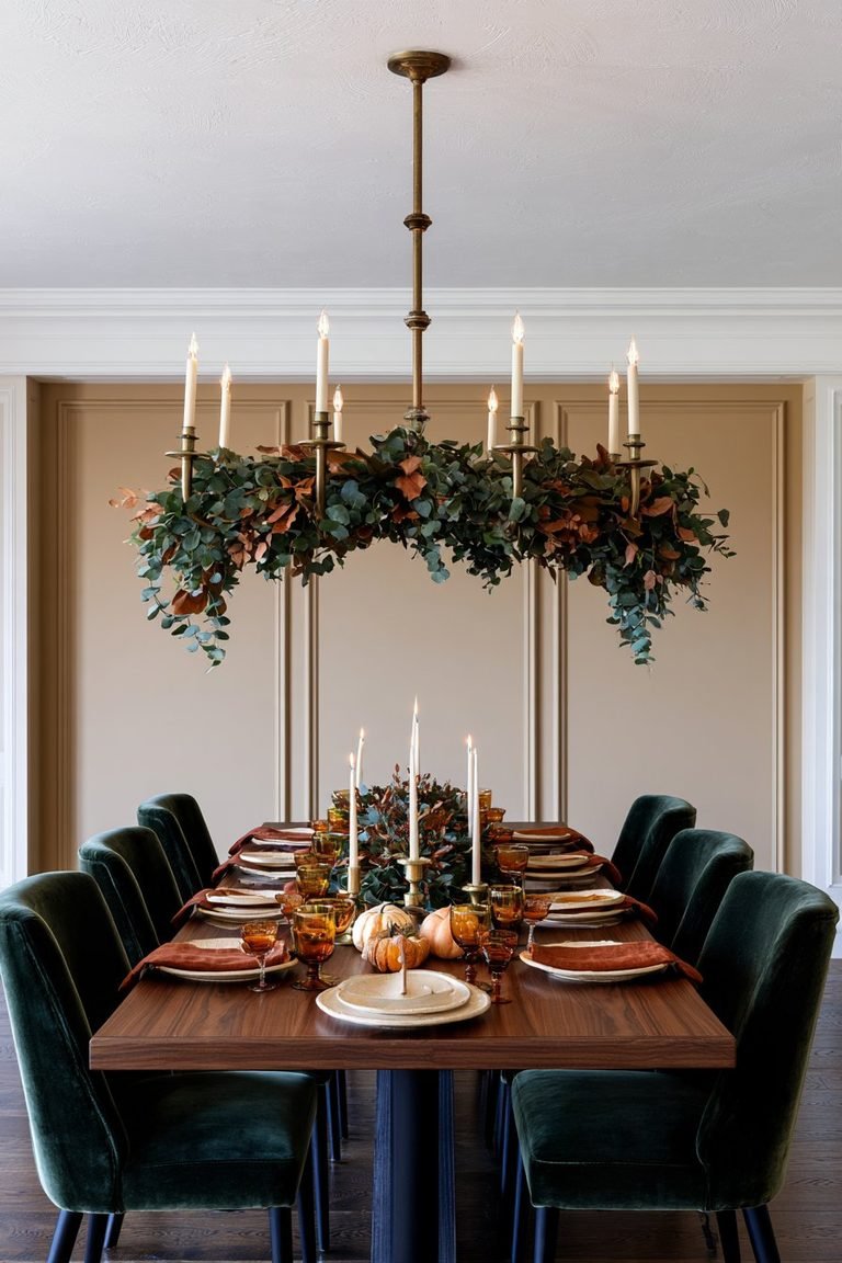
Colour drenching is the practice of painting walls, ceiling, trim and often even furniture in a single colour. The result is a seamless, enveloping room with no sharp breaks between surfaces.
These 25 colour drenching ideas cover the best shades, surfaces and rooms to try. Each one can work in a small powder room or a full living space, and each can be adjusted to suit modern, traditional, Scandinavian or eclectic styles.
Wall-to-Ceiling Wrap
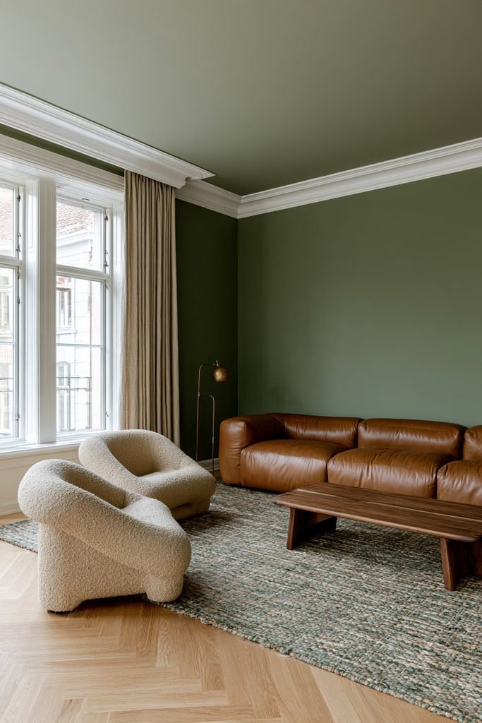
Paint the ceiling in the same colour as the walls to remove the visual break at the top of the room. Designers at Decorilla note that carrying one tone from the walls up to the ceiling can create an infinity feeling and make a room feel taller.
A matte finish overhead can keep the surface soft under lamplight. Testing a sample on both the ceiling and the walls first can show how light shifts the colour across the day.
Trim Included
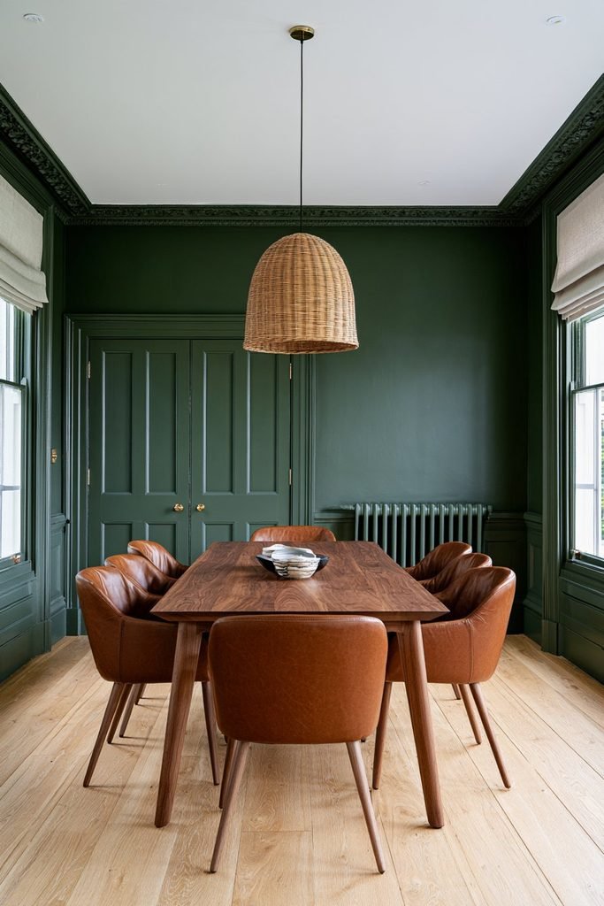
Extend the colour to skirting boards, door frames, window frames and radiators so no white outline interrupts the scheme. A sage green applied to every painted surface can make older architectural details recede into one calm backdrop. Using the same sheen on every trim surface can keep the colour looking consistent from edge to edge.
Deep Green Cocoon
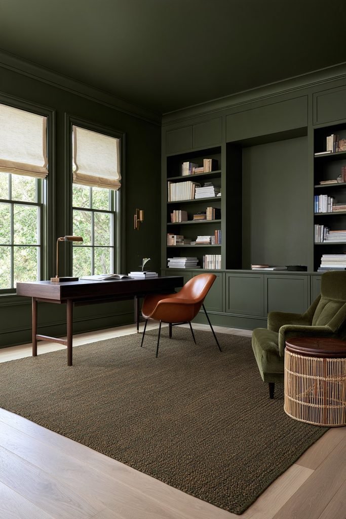
Choose a deep green for a rich, enveloping feel in a living room or study. Designers quoted by Livingetc point out that very deep greens often work well for drenching because contrast can feel too harsh against them.
Walnut furniture and brass lighting can add warmth to the look. Dark green also pairs well with natural materials such as rattan, leather and aged brass for a collected, library-like feel.
Moody Navy Study
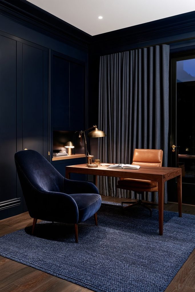
Use midnight blue or navy to create a snug feel in a home office or den. Pair a navy velvet armchair with a slate wool rug so the room reads as layered rather than flat. Warm table lamps and a few brass accents can stop a dark blue room from feeling cold in the evening.
Charcoal Drama
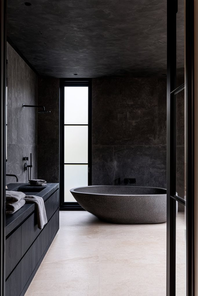
Apply charcoal grey to every wall for a grounded, gallery-like feel. Paint brand Little Greene suggests surrounding a bathroom with its charcoal grey Vulcan on all four walls.
Matte black fixtures and white towels can sharpen the effect. Layering charcoal with soft grey linen and black-framed art can keep the look sophisticated rather than heavy.
Terracotta Warmth
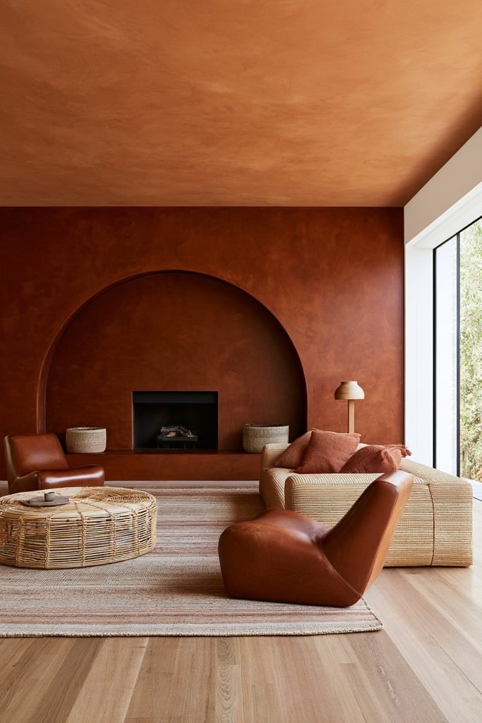
Wrap a living room in terracotta for a welcoming glow that encourages conversation. Decorilla pairs rich terracotta with textured throws and ambient lamps, and rattan furniture can add a natural layer. Wooden floors and woven baskets can balance the warmth so the colour feels earthy instead of overwhelming.
Soft Blush Bedroom
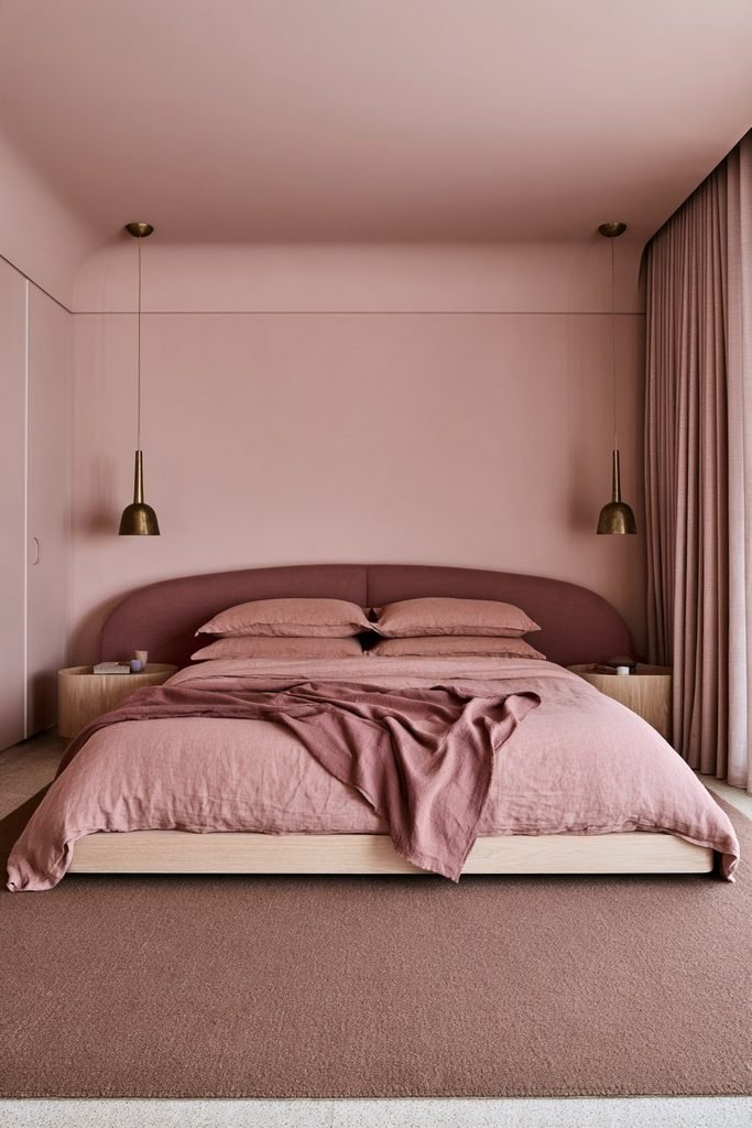
Try a low-contrast blush for a restful bedroom that still feels fully committed. A roundup of bedroom drenching ideas recommends using a range of tones within one colour family to add dimension, while avoiding shades with clashing undertones.
Linen bedding in a slightly deeper blush can keep the palette layered. A pale oak bed frame and soft brass lighting can keep the room feeling calm and unfussy.
Light Neutral Drench
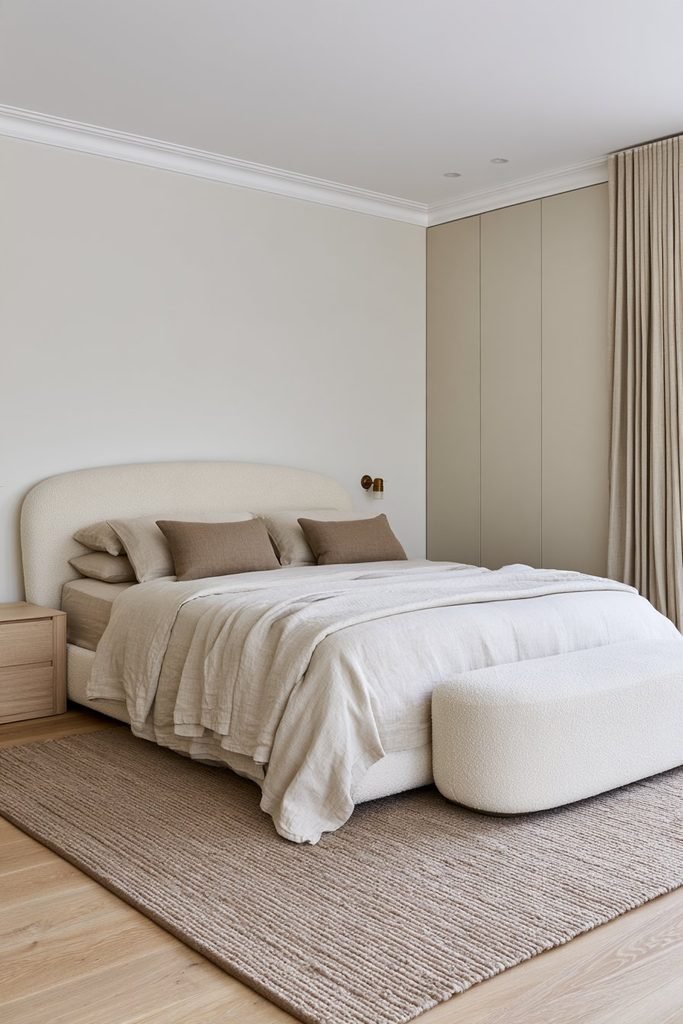
Drench a room in a warm mid-tone neutral such as mushroom or greige for a quieter take on the trend. Designer Gemma Tucker of Balance Interior Design favours the cocooning effect of warm mid-tone neutrals in bedrooms and bathrooms.
Cream bouclé and pale oak can keep the room soft and cohesive. This approach can suit renters and traditional homes alike, since a quiet palette rarely clashes with existing furniture.
Pale Blue Calm
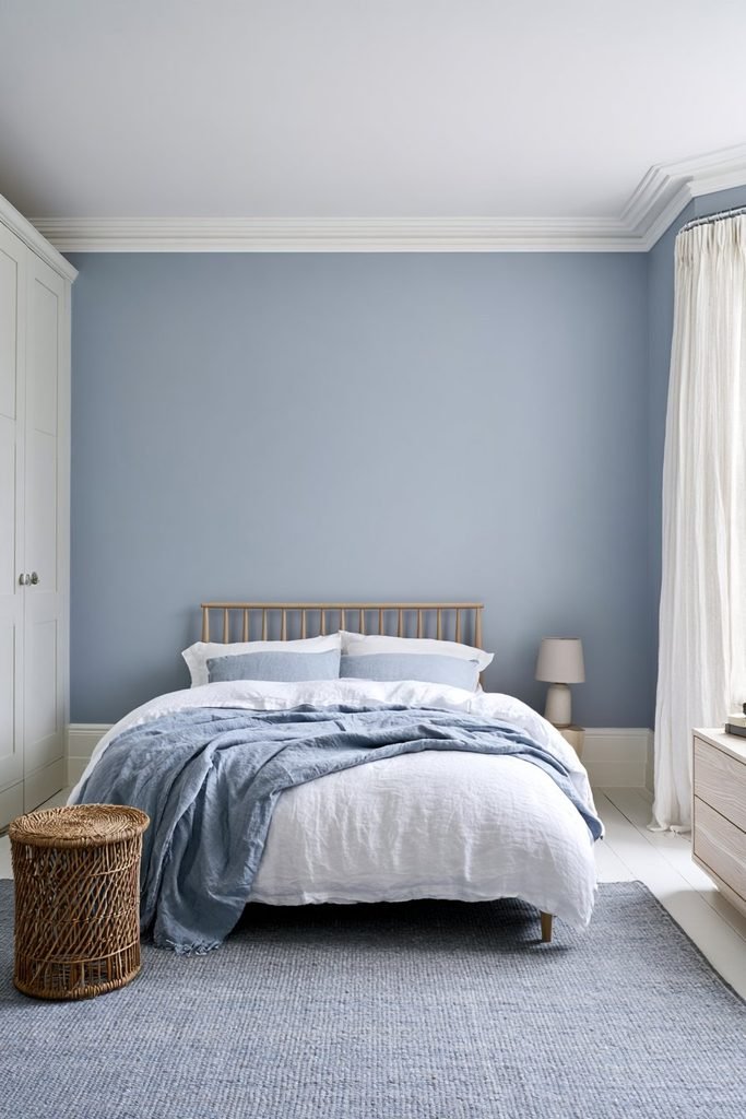
Choose a pale blue for a tranquil feel in a small bedroom or nursery. Behr’s blue-gray Half Sea Fog shows how a soft, quiet hue can carry a full drenched scheme.
White cotton bedding and light wood furniture can keep the room airy. Whites, creams and pale woods can sit alongside it without competing for attention.
Sunny Yellow Glow
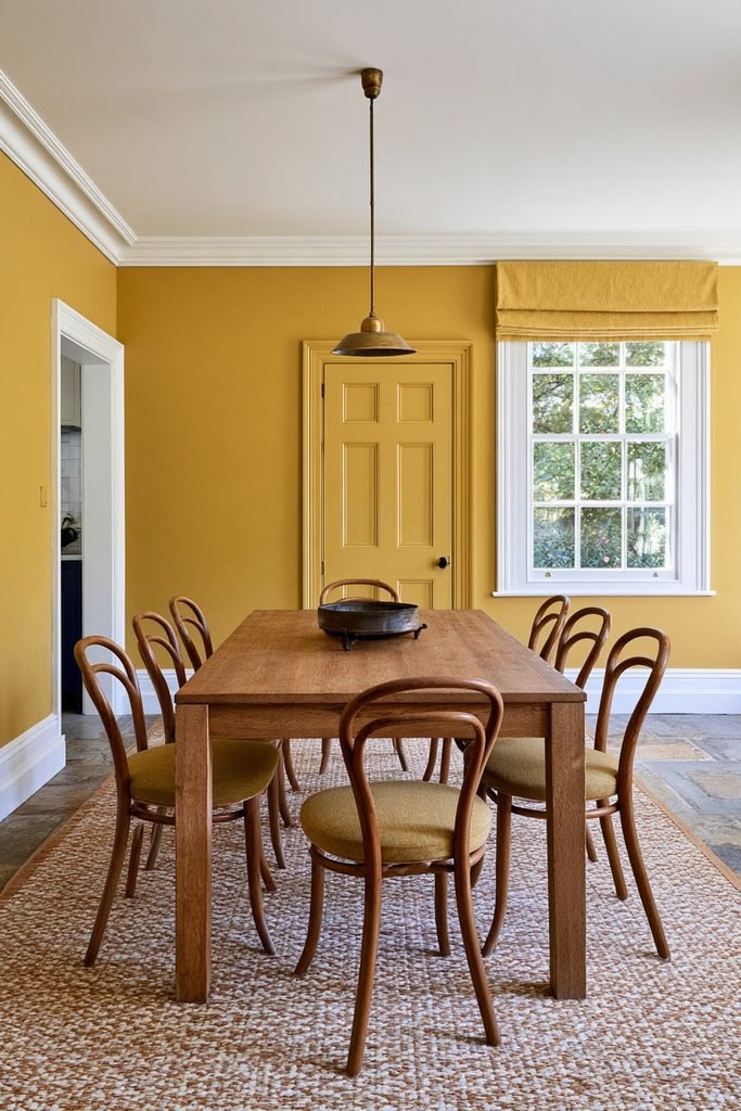
Bathe a room in yellow for a cheerful, sunlit feel on even the greyest days. Little Greene recommends carrying yellow across all four walls and the woodwork, which can suit kitchens and breakfast rooms well. Natural light can make the shade glow, so a south-facing room can carry it especially well.
Teal Home Bar
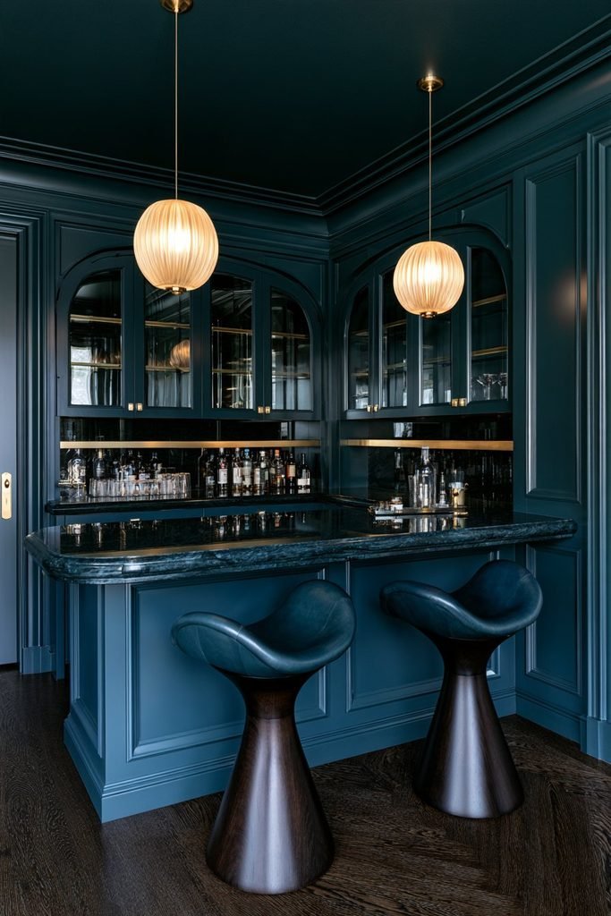
Layer shades of teal to give a home bar a jewel-box feel. Designers Chelsey Cox and Rachel Rector of Chinotto House drenched a home bar in layered turquoise and deep teal inspired by the springs near Gainesville, Florida.
Brass shelving and glass can add a polished finish. A glossy bar top and warm pendant lighting can add reflection and contrast within the single-colour palette.
Burgundy Dining Room
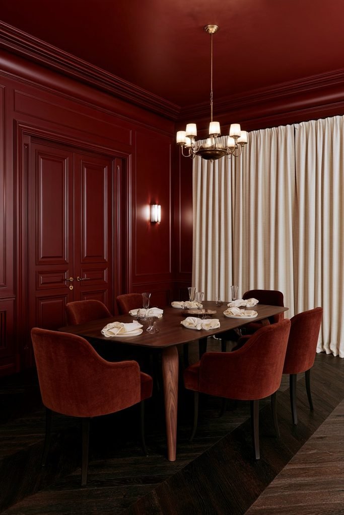
Use burgundy or deep red to make a dining room feel intimate and luxurious. Behr shows its ruby red Rumors applied consistently across the walls, ceiling and door frames for a dramatic, cohesive effect.
Candlelight and a dark wood table can complete the mood. A brass chandelier and cream linen napkins can introduce warmth while the walls do the work.
Matching Curtains
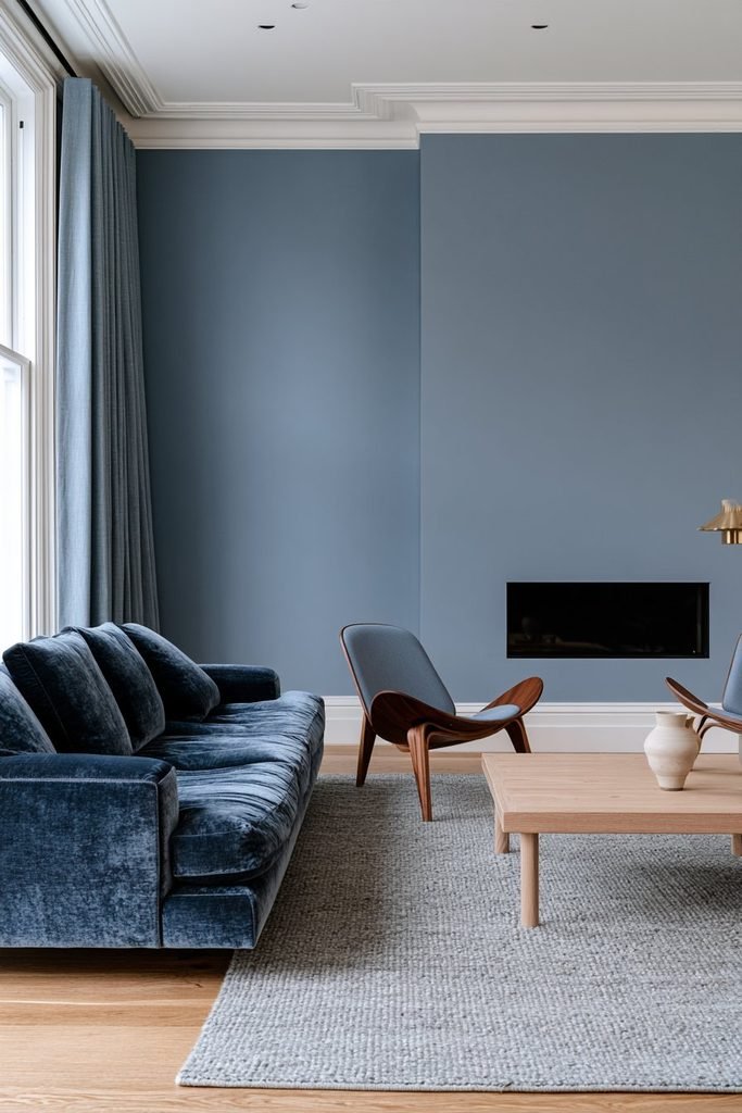
Choose curtains that match the wall colour as closely as possible to keep the scheme unbroken. Russell’s Curtains advises this approach for drenched rooms, even though curtains are usually chosen to contrast with the walls. Lined fabrics in velvet or heavy linen can also help the curtains hang with a rich, tailored look.
Tonal Sofa
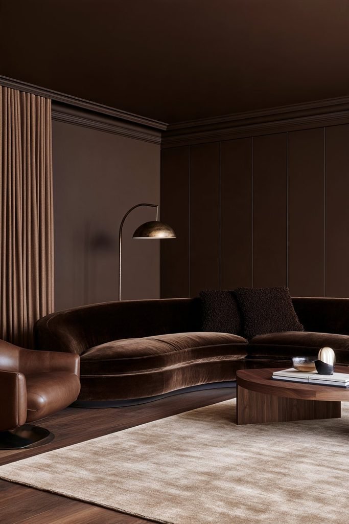
Add a sofa or wide armchair in the same colour to blend large furniture into the backdrop. A velvet sofa one shade deeper than the walls can add depth without breaking up the single-colour look. Choosing different textures within the same colour, such as bouclé against velvet, can stop the room from looking flat.
Fireplace Blend
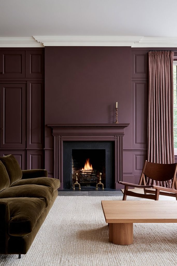
Paint the fireplace to match the walls and skirting boards for a seamless finish. Valspar recommends this approach for rooms with a feature fireplace.
A single contrasting object on the mantel, such as a brass candlestick, can give the eye a place to rest. Painting the mantel and surround in a slightly glossier finish can bring out the detailing.
Built-In Shelves
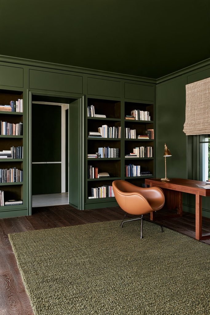
Drench alcoves and built-in shelving in the wall colour so the storage becomes part of the architecture. Little Greene notes that panelling, alcoves and cabinets add depth in a drenched room because they create shadows that light picks out. Painting the interior back panels a shade deeper can add dimension to the shelves without adding a second colour.
Panelled Walls
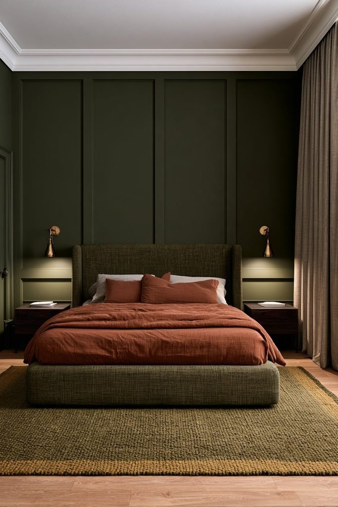
Paint wall panelling and the surrounding wall in one colour to emphasise the profile of the mouldings. Shaker-style panels in a deep olive can give a traditional room a modern, tailored feel. Picture-frame mouldings and wainscoting can work well with this approach, and the panels can look more sculptural in low light.
Double Drenching
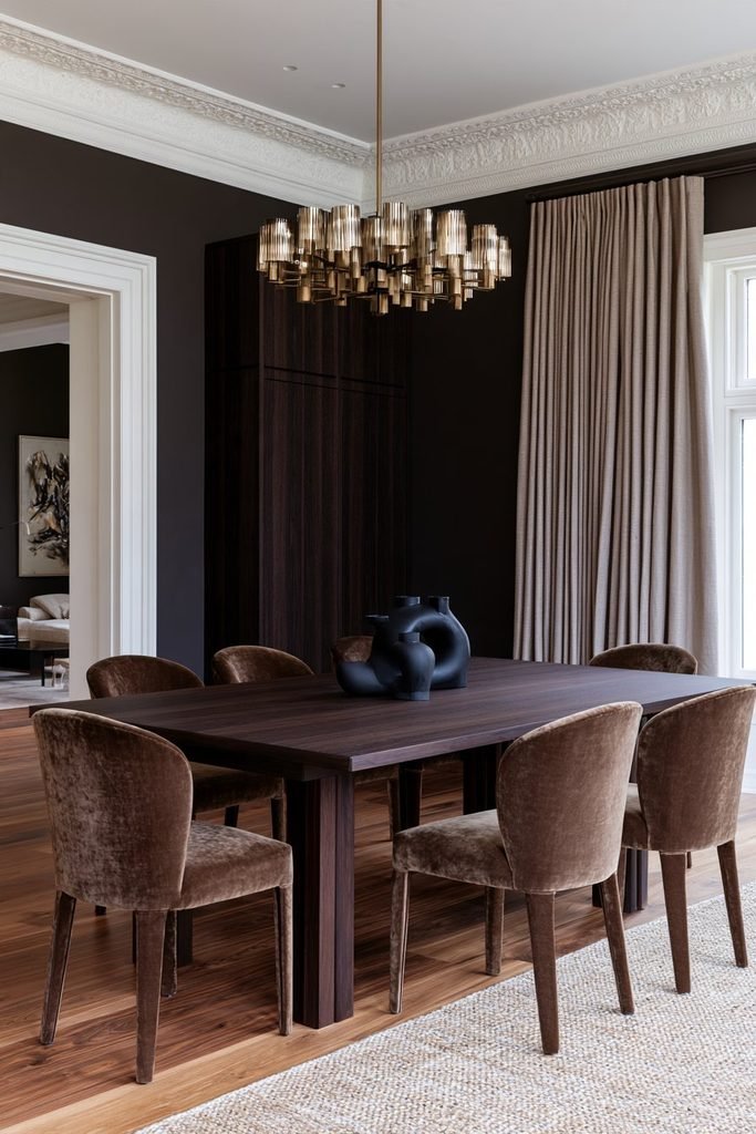
Layer two closely related hues, one on the walls and one on the trim or ceiling, for a richer monochrome look. Behr’s dining room pairing of Dark Truffle and Baronial Brown shows how this approach can add depth while keeping the scheme tonal. Choosing hues from one family with matching undertones can help the two shades read as intentional rather than mismatched.
Mixed Finishes
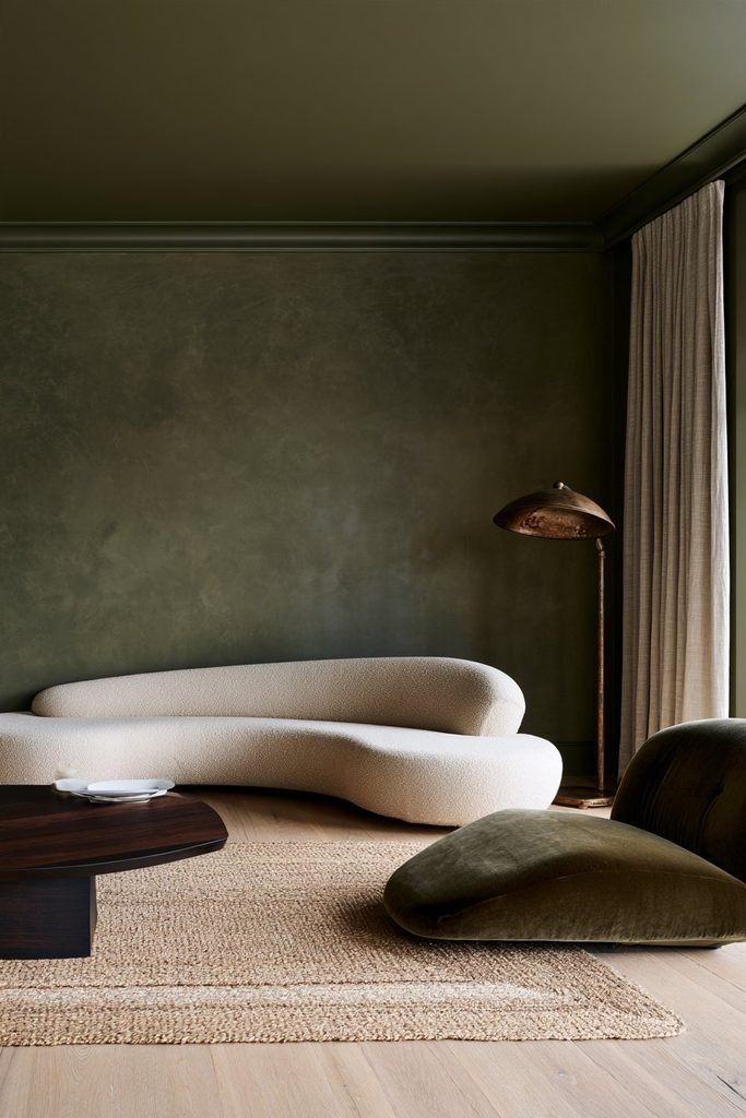
Vary the sheen while keeping the colour identical to prevent a drenched room from feeling flat. Olive & June Home suggests limewash on the walls, matte paint on the ceiling and a glossy sheen on the trim, all in the same colour. Painting the skirting in a satin finish and the walls in matte can give the look more depth while keeping the colour the same.
Texture Layers
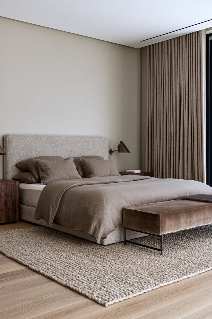
Add bouclé, velvet, linen and woven textiles in matching tones to bring dimension to a single-colour room. Matching a rug and cushions to the walls in different textures can keep the scheme rich without introducing a second colour. Chunky knits, rattan and woven wool can also be added in the same family of tones to build visual depth.
Small Bathroom Drench
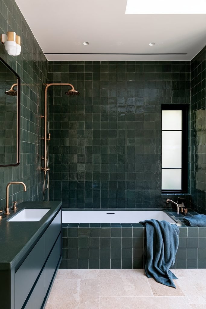
Drench a small bathroom in a bold colour, since compact rooms can suit the technique well. Ideal Home recommends considering the ceiling as the fifth wall in a tiled room and choosing textured tiles for added interest. Matching towels and a painted ceiling can complete the enveloping feel without needing extra decor.
Kitchen Cabinets
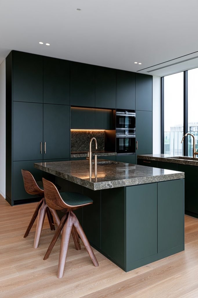
Paint cabinetry, walls and trim in one colour for a cohesive kitchen. Decorilla’s black contemporary kitchen shows how a dark drenched scheme can feel sleek, while Little Greene suggests dark shades add a touch of luxury to practical rooms like kitchens.
Warm lighting under the cabinets can add dimension. Matching handles in brushed brass can add a finishing detail without needing a second paint colour.
Wallpaper Alternative
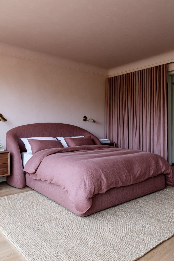
Use wallpaper in a tonal pattern if paint is not an option, particularly in a rental. Martha Stewart Living notes that wallpaper can work for drenching and suggests limewash or plaster as textured alternatives to flat paint.
Peel-and-stick wallpaper in a single colour can be a renter-friendly route. Choosing a wallpaper with a subtle texture in the same tone as the trim can keep the look layered and cohesive.
Frequently Asked Questions
Do you paint the ceiling when colour drenching?
Yes. Painting the ceiling in the same colour as the walls is the defining feature of the technique, and a matte finish can keep it soft.
Can colour drenching work in small rooms?
It can. Dark tones can create a cosy, cocooning effect in a small room, while lighter hues can make it feel more open.
Does colour drenching make a room look bigger?
It can, depending on the colour. Removing contrast between walls, ceiling and trim reduces visual interruptions, which can make a room feel more expansive.
Does colour drenching work in open-plan spaces?
It tends to work best in defined rooms. Open-plan layouts can make colour transitions harder to manage, so a single zone or alcove can be a safer place to start.