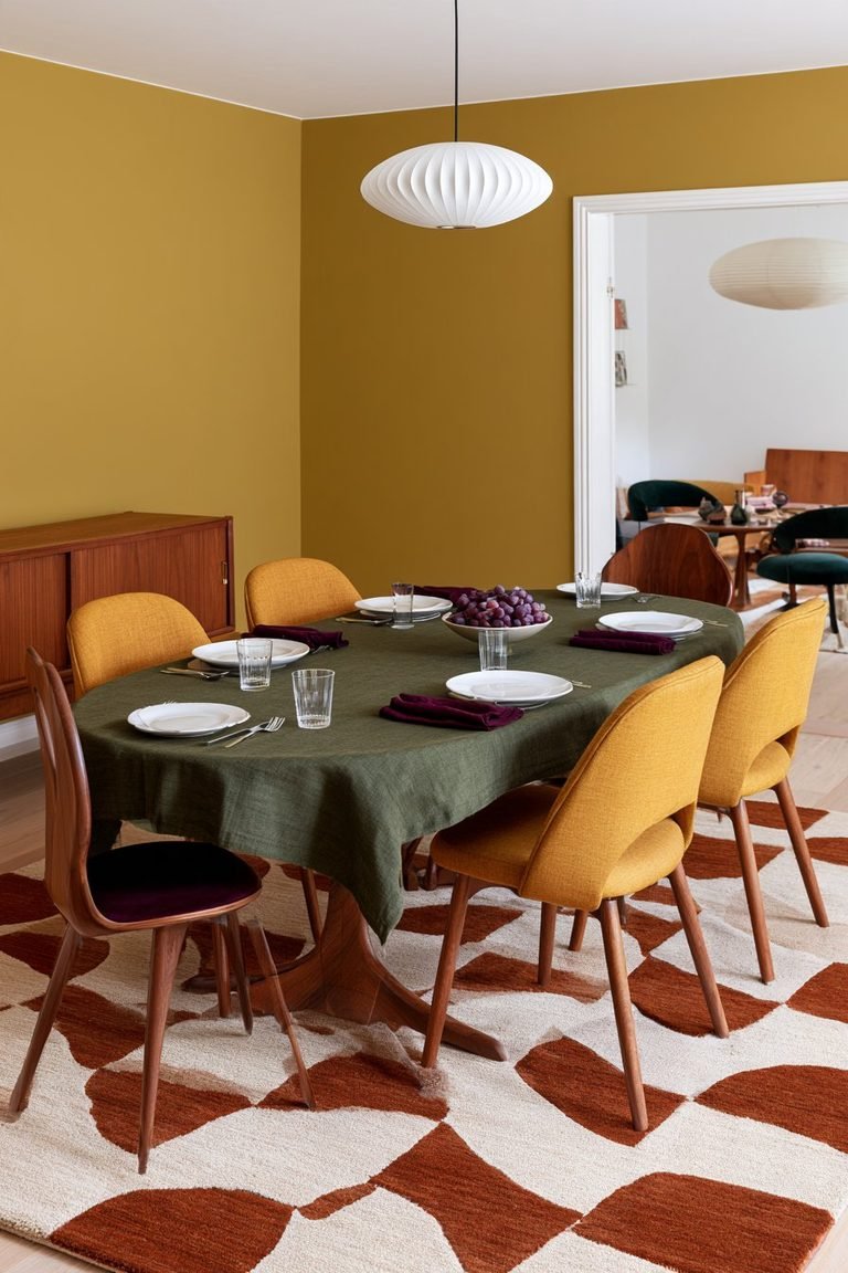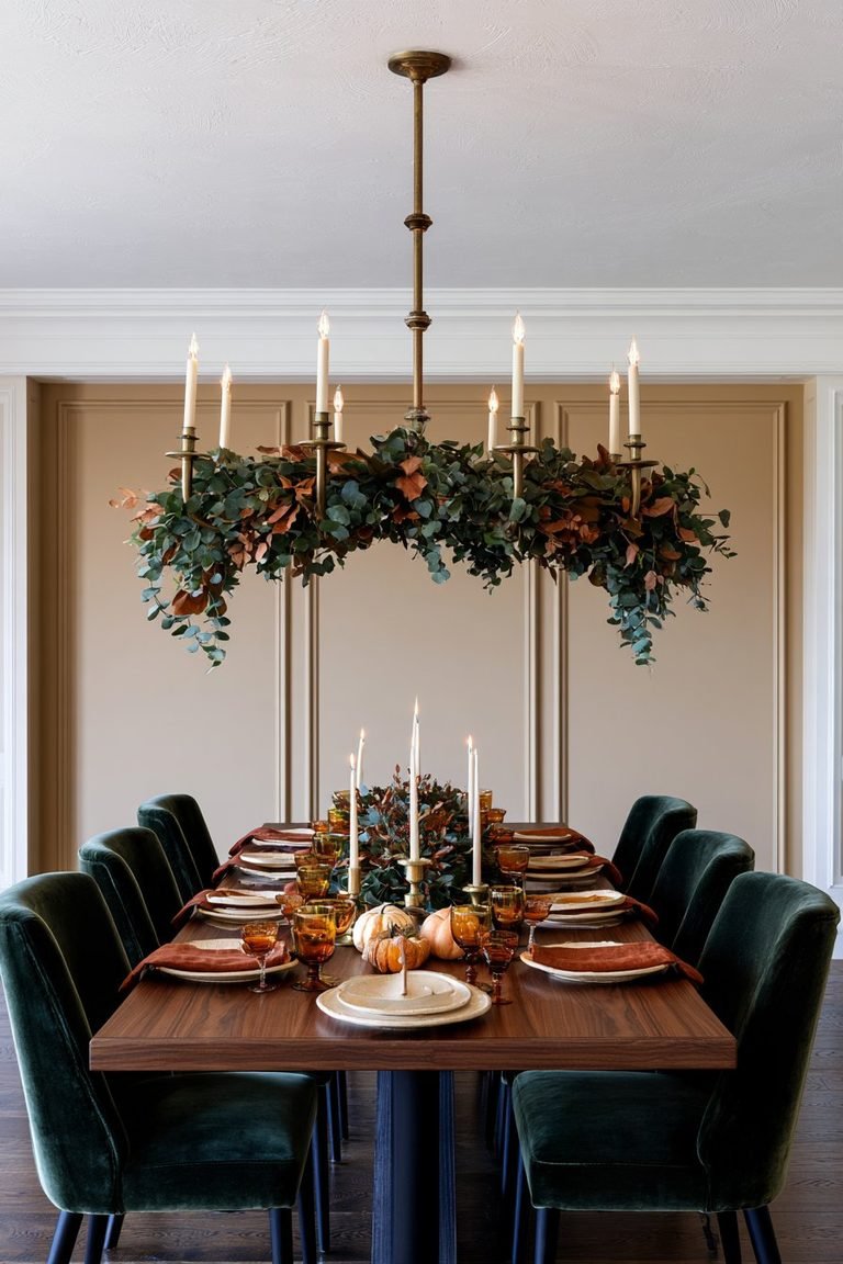
I’ll be honest: I used to think dark living room decor ideas were reserved for oversized homes with endless natural light. Contrary to popular belief, these moody, dramatic hues are increasingly going mainstream, gracing spaces of all sizes. In fact, dark living room ideas can create a lovely cocooning effect that actually makes smaller rooms feel bigger. Throughout my journey in home décor, I’ve discovered that a cozy moody living room isn’t about sacrificing brightness—it’s about embracing rich tones like deep charcoals, inky blues, and warm earthy shades that instantly transform your space into a cozy dark living room sanctuary.
Deep Navy Walls with Warm Brass Accents
Why Navy Creates a Cozy Moody Living Room
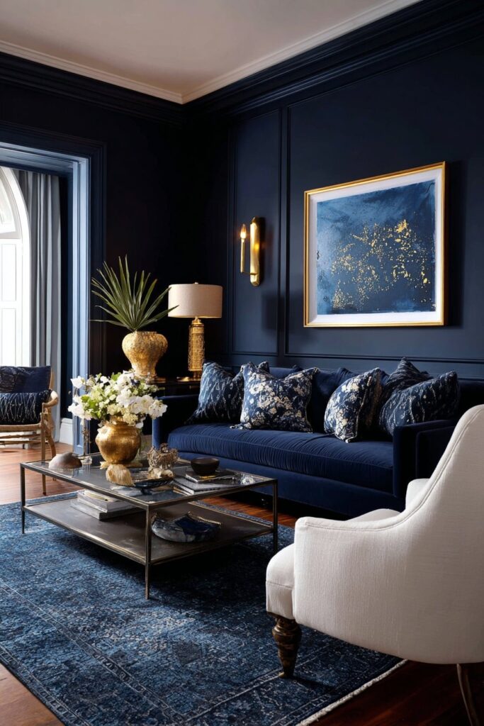
Navy blue strikes the perfect balance between bold color and classic neutrality. When I first painted my living room navy, I was surprised by how it transformed the atmosphere. Rather than feeling dark or oppressive, the space became this cocooning sanctuary that felt both sophisticated and welcoming. Navy’s versatility lies in its ability to act almost like a neutral while still delivering that moody depth we crave in dark living room ideas.
The psychology behind navy walls is fascinating. This deep hue creates a sense of calm and tranquility in ways that lighter blues simply can’t achieve. I’ve worked with clients who were initially hesitant about going dark, but navy proved to be the gateway color that gave them confidence to embrace bolder dark living room decor ideas.
Choosing the Right Shade of Navy
Selecting your navy shade requires attention to undertones. Hale Navy by Benjamin Moore remains my top recommendation because it’s deep enough to offer great contrast while maintaining enough blue pigment that it never gets confused with black. For clients wanting something with more maritime depth, I suggest Naval by Sherwin-Williams, which captures that perfect hint of dark sea and night sky.
Important to realize, some navies lean cooler while others pull warmer tones. If your space lacks natural light, I’d steer you toward options like Benjamin Moore’s Mysterious, an almost-black blue that reads sophisticated rather than heavy. For rooms with abundant windows, consider Gentleman’s Gray, which surprisingly pulls green undertones despite its name.
Brass Fixtures That Complement Dark Walls
Pairing navy walls with brass accents creates an opulent yet approachable aesthetic. The somber tones of blue allow gold and brass to radiate without seeming gaudy. I’ve found that brass works best in small, subtle doses—think picture frames, mirrors, or light fixtures rather than overwhelming metallic elements.
Shera’s Take on Navy and Brass Pairings
In my own projects, I’ve discovered that mixing navy with warm brass creates visual warmth that prevents the space from feeling cold. Gold-trimmed mirrors positioned strategically can bounce light around the room while adding that refined metallic accent. The key is restraint; you’re aiming for touches of elegance, not a jewelry box effect.
Charcoal Grey Living Room with Velvet Textures
The Psychology Behind Dark Grey Spaces
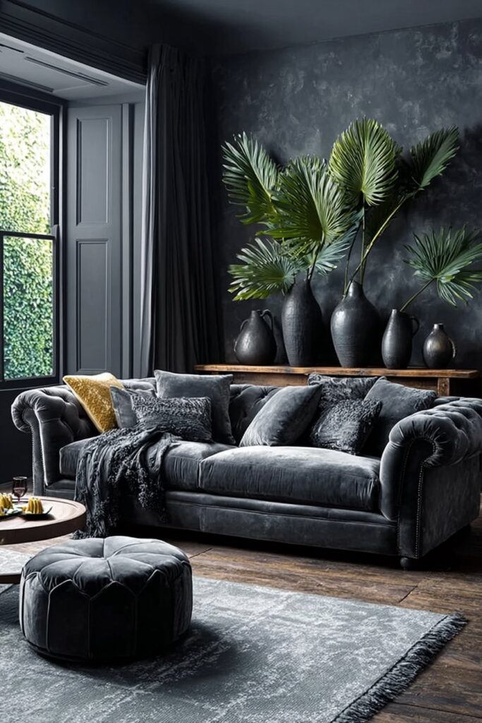
Charcoal grey possesses a grounding quality that adds sophistication to any space. When I transformed my first client’s living room with charcoal walls, I noticed how the rich neutral enveloped the room in understated elegance rather than overwhelming it with boldness. Unlike lighter neutrals, charcoal makes a deliberate statement—confidence and decisiveness shine through in your dark living room decor ideas.
The psychology here is fascinating. Charcoal is associated with stability and reliability, often used where professionalism and competence matter. In a cozy moody living room, this translates to a space that feels anchored and secure. I’ve watched hesitant clients fall in love with charcoal because it offers that perfect backdrop for both bold accents and subtle textures.
Layering Velvet for Maximum Coziness
Grey velvet sofas became my go-to recommendation for clients seeking that luxurious tactile experience. The deep, rich pile of velvet catches light beautifully, adding depth and dimension to the sophisticated grey hue. I particularly love charcoal velvet because it’s remarkably versatile, complementing styles from modern glam to mid-century.
Layering velvet with other textures creates surprising depth in a moody living room. Throw pillows ranging from almost-black charcoal to lighter smoke shades form a monochromatic arrangement with dimension. Add chunky knits or plush cashmere throws in coordinating neutrals for warmth.
Color Accents That Pop Against Charcoal
Charcoal pairs seamlessly with both cool and warm tones. For a sophisticated look, incorporate bright whites to add serious depth and contrast. I’ve also successfully used burnt orange for bold warmth, blush pink for soft contrast, and hunter green for grounded elegance.
Lighting Techniques for Grey Rooms
Lighting transforms charcoal from potentially gloomy to unquestionably chic. Warm-toned bulbs between 2700-3000K add depth and create warmth. I always recommend multiple light sources at varying heights—ceiling fixtures, wall sconces, table lamps, and floor lamps—to create layers that enhance the room’s depth.
Forest Green Paneled Walls
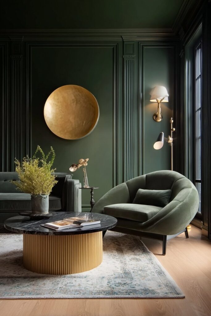
Why Green is Perfect for Moody Living Rooms
Forest green stopped me in my tracks during a client consultation last year. The color is invigorating, fresh and evokes feelings of renewal and growth. When executed properly, green has an almost magical effect on spaces and creates a sanctuary-like feel. What surprised me most was discovering that forest green is a bold, energizing color that comes in a wide range of shades, making it incredibly adaptable for various dark living room decor ideas.
Dark greens make a soothing but striking statement in a living room. I’ve watched clients initially hesitant about moody living room colors fall in love with deep forest green because it delivers drama without feeling heavy. The versatility is remarkable—it can be dressed up with elegant finishes or made casual with earthy furniture and decor.
Paneling Styles That Add Depth
Adding paneling transforms forest green walls from beautiful to extraordinary. I recommend pairing a wallpaper mural with painted wall paneling for creative depth. Half-wall paneling options like chair rail molding, beadboard, and board and batten are all great choices for this look, essentially creating architectural interest that plays beautifully against the rich color.
Pairing Green with Natural Wood Tones
The combination of forest green walls with natural wood creates instant coziness. Warm woods, leathers, and velvets against the green backdrop makes a space feel downright cozy. This warm and cool color combination is an ideal way to create a comforting yet stylish living space. Equally effective are cool-toned woods like ash or pine, which pair nicely with green walls when used for furniture pieces.
For a muted moody effect, stick to dark colors and muted shades of green. Black, brown, and taupe are great complementary color choices for deep, earthy greens, creating that cozy dark living room atmosphere we’re aiming for.
All-Black Walls with Statement Art
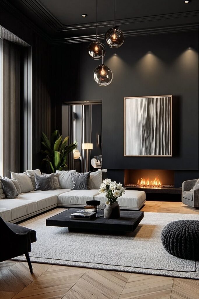
Making Black Feel Inviting Not Oppressive
Black walls create a dramatic and chic atmosphere that’s instantly relaxing and surprisingly inviting when done right. I learned this firsthand when I painted my home office black three years ago. The trick is pairing black with warm neutrals like ivory, beige, and taupe. Soft lamps, textured rugs, and linen curtains add depth, transforming what could feel stark into something genuinely cozy.
Texture becomes your best friend in all-black spaces. I always layer materials—think leather, velvet, chunky knits, and natural wood—to create softness and mystery that prevents the look from feeling flat.
Choosing Art for Dark Backgrounds
Art pops beautifully against black walls, making each piece stand out more than it would on white. Black creates an excellent background for colorful gallery walls. Black and white portraits, travel shots, line art, and minimalist typography look razor sharp on dark walls. Color photos also work if you add a printed white border.
Sizing matters more than you’d expect. Target about two-thirds of your furniture width for wall art, keeping 2 to 3 inches between frames.
Gallery Wall Arrangements for Black Walls
Black walls love structure, so simple gallery layouts work best. Grid arrangements create clean symmetry that feels modern and architectural. Staggered salon styles with varied sizes and balanced negative space also shine.
Shera’s Personal Experience with Black Spaces
Working with a client last fall, we transformed her windowless basement into an elegant home office using black paint throughout. Paired with recessed lighting and strategically placed art, the space became sophisticated rather than cave-like.
Balancing Drama with Comfort
Gold accents warm up black spaces wonderfully. When introducing color into mostly black rooms, make sure to add plenty of white for balance and visual breathing room.
Rich Burgundy and Plum Tones
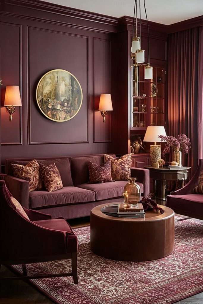
Warm Dark Colors for Ultimate Coziness Plum transformed my perspective on what dark living room ideas could achieve. This deep purple with reddish undertones immediately gives a room depth. Cool and warm simultaneously, plum balances heat and abundance while delivering that moody, cocooning effect we’re after. When I selected plum for a client’s living room last year, the transformation was remarkable. The color creates an incredibly sophisticated, regal, and luxurious interior.
Burgundy shares this warmth. Named after fine wine, burgundy brings warmth and sophistication to spaces. As a deep reddish-brown with purplish undertones, burgundy works as both a neutral when paired with brighter colors and as a pop when combined with grays or blacks. Both colors are ideal for rooms you’ll use during evening hours, creating that sort of sexy and moody effect perfect for a cozy dark living room.
Mixing Burgundy with Neutrals
Pairing burgundy with cream remains timeless and elegant, bringing warmth and sophistication to interiors. The secret lies in how cream allows burgundy to take center stage without overwhelming the space. For low-light rooms, opt for burgundy with warmer undertones. Balance this richness with complementary neutrals like soft cream or pale grey to offset its depth and create an airy feel.
Gray pairs fabulously with plum tones. Light blues, soft grays, and silvers make good companions, while lavenders and greens offer easy color harmony. Burgundy also complements warm wood tones like oak and walnut beautifully.
Textiles and Fabrics in Deep Red Tones
Texture becomes critical with these colors. Plum can fall flat on plain linen or tight weaves. I love seeing plum in silk and velvet, where it comes out romantic and moody. Focus on furnishings with plush rugs and fluffy textures to create that ideal cocooning effect, making your moody living room both opulent and inviting.
Dark Teal with Colorful Pops
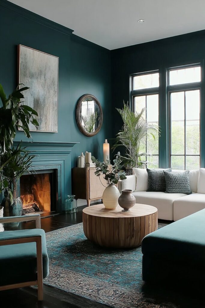
Creating Contrast Against Teal Walls
Teal sits beautifully between blue and green, creating a rich and enveloping hue that feels cocooning rather than cold. I discovered this when working with a client who wanted moody living room vibes but worried navy felt overdone. Teal became the perfect alternative, offering that dark moody living room atmosphere with unexpected warmth.
The magic happens when you brighten up dark teal walls with a rainbow of accessories. Vibrant splashes of color pop against this backdrop in ways that surprised even me. In reality, darker shades of teal can act as a neutral, especially when paired with brighter hues.
Playful Color Combinations
For those unafraid of contrast, orange sits opposite teal on the color wheel, creating balanced, visually stimulating schemes. Coral and teal feel retro and cool, while bubblegum pink with teal creates an energetic palette. I’ve also paired mustard and teal successfully—both deep, saturated hues that match beautifully.
Blush and teal feel lively and youthful, a combination I used in a client’s space last spring. The result was feminine without being overly sweet. For something striking, cayenne and teal deliver exciting contrast.
Maintaining Balance in Bold Spaces
Balance becomes critical in these bold dark living room decor ideas. Large teal pieces need to dominate the space. When I designed a living room with chocolate brown walls, the teal couch and ottoman were substantial enough to handle the darkness.
How Shera Uses Teal in Client Projects
In my projects, I often incorporate teal because of its balance of blues and greens. Mediterranean Teal works perfectly in living spaces, creating cozy yet sophisticated atmosphere when paired with warm brass accents and plush furniture. The key is layering—mustards, lavender, or minty greens complement teal’s cool undertones.
Chocolate Brown Living Room Walls
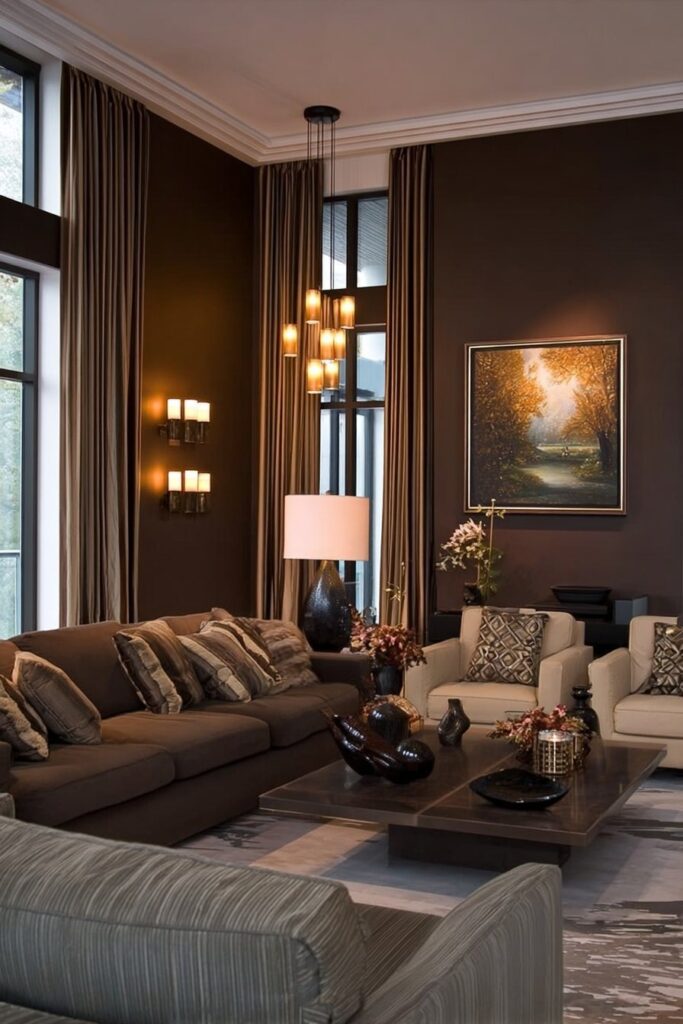
The Revival of Brown in 2026
Chocolate brown surprised me when it started appearing in nearly every design publication this year. According to the 1stDibs 2026 trend report, chocolate brown topped their color forecast with 33% of designers selecting it as their top choice. That figure has nearly doubled since 2022, signaling a major shift away from cool minimalism toward warmer, more emotionally grounded spaces. In fact, searches for ‘brown living room’ increased 180% year-over-year.
I worked with a hesitant client last month who thought brown felt dated. Once we painted her living room in a rich chocolate shade, she understood. Brown is psychologically associated with stability and grounding, creating a sense of security. The warmth and comfort these dark moody living room walls provide elevates perceived room temperature, perfect for cozy dark living room environments.
Choosing the Right Brown Undertones
Not all browns are created equal. Chocolate brown can have red undertones that pair well with burgundy and orange, yellow undertones that work with golds and mustards, or gray undertones for a cooler, more modern feel. Always test paint samples on multiple walls and observe them at different times of day. I learned this the hard way when a seemingly perfect brown looked completely different under evening light.
Pairing Brown with Pink and Blush Accents
Brown and pink are adjacent on the color wheel, with pink being a tint of red and brown a shade of orange. This relationship creates unexpectedly soft and harmonious pairings. One of the best combinations, brown and pink offer warmth while striking visually appealing contrast.
For metallics, use gold, brass, or bronze instead of silver. Sage green or deep emerald also refreshes brown spaces beautifully, adding organic softness to these dark living room decor ideas.
Moody Blue Ceiling Treatment
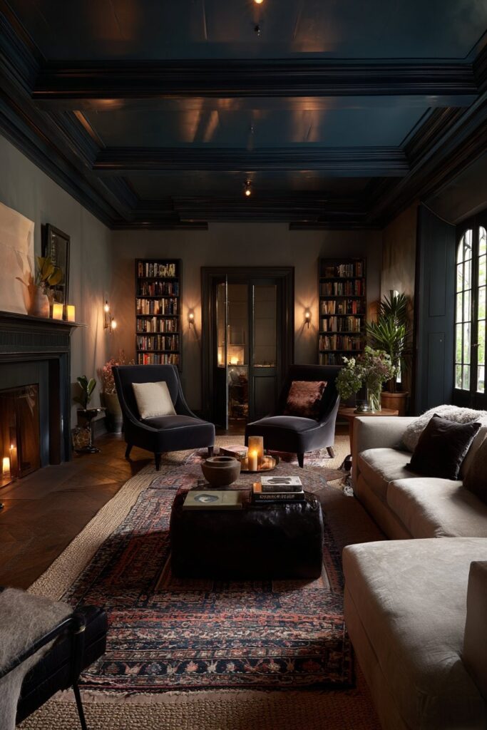
The fifth wall — the ceiling — is the most underused canvas in dark living room design. When I first suggested painting a client’s ceiling in a moody dusty blue, she looked at me like I’d lost my mind. Two weeks after the project was finished, she called it the single best decision in the entire renovation. A painted ceiling in a dark living room doesn’t just add color — it wraps the room in atmosphere, making the space feel deliberately enveloping rather than accidentally dim.
Why Ceiling Color Changes Everything in Dark Rooms
In a conventional living room, a white ceiling acts as a reset — it lifts the eye and signals that the room below it, however colorful, exists within a bright, neutral container. In a dark living room, that white ceiling becomes a jarring contradiction. It’s like wearing a dramatic evening gown with sneakers. The room commits to darkness on every wall and then apologizes for it overhead. A moody ceiling eliminates that contradiction entirely. When the ceiling shares or complements the wall’s dark palette, the room achieves what interior designers call “total enclosure” — the feeling of being held within a space rather than simply standing in it.
Choosing the Right Blue for Your Ceiling
Not all blues behave the same overhead. I recommend steering away from bright or medium blues, which read as cold and clinical when you’re looking up at them from a sofa. Instead, go for dusty, grayed-out blues — shades like Farrow & Ball’s Mizzle, Benjamin Moore’s Van Deusen Blue, or Sherwin-Williams’ Indigo Batik. These are blues with enough grey in them that they read as sophisticated rather than playful, atmospheric rather than childlike. The key is choosing a ceiling shade that is two to three values lighter than your walls so the ceiling recedes slightly rather than bearing down on you, while still maintaining the overall dark, enveloping mood.
How to Pull the Look Together
The trim color becomes critically important when you paint a ceiling dark. I almost always recommend painting the trim — crown molding, baseboards, door frames — in the same dark tone as the walls rather than white. White trim with dark walls and a dark ceiling creates a three-tone striped effect that fragments the room visually. Tonal trim unifies everything, making the architecture disappear and the atmosphere take over completely. Pair the ceiling treatment with recessed lighting using warm 2700K bulbs and dimmer switches — adjustable brightness lets you control exactly how enveloping the room feels at different times of day.
Shera’s Take on Ceiling Treatments in Dark Rooms
My personal favorite approach is going slightly glossier on the ceiling than the walls. A satin or eggshell finish on a dark blue ceiling reflects the warm light from lamps below it, creating a gentle shimmer overhead that feels extraordinarily luxurious. The ceiling becomes almost water-like — a still, dark pool above you that reflects warmth rather than absorbing it. It’s one of those effects that photographs rarely capture but stops every single person who walks into the room in their tracks.
Warm Terracotta and Deep Rust Tones
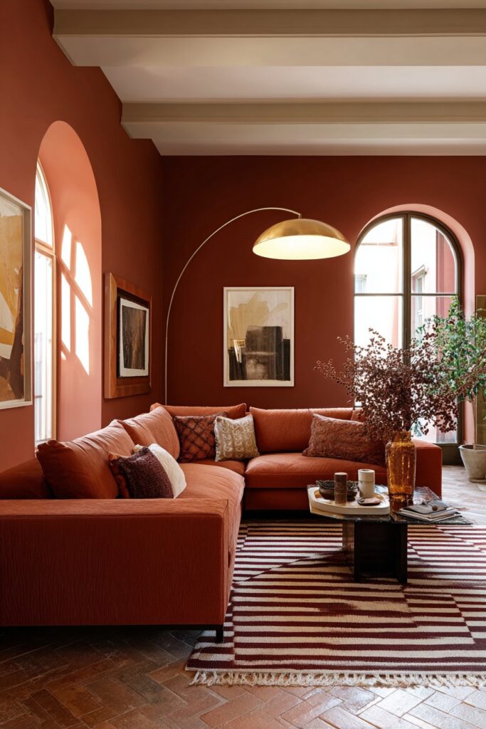
Why Terracotta Creates the Warmest Dark Living Rooms
The warmth that terracotta and rust tones bring to a dark living room is physical as well as psychological. Research consistently shows that rooms in warm color palettes — reds, oranges, earthy tones — are perceived as several degrees warmer than identically heated rooms in cool colors. In a space already committed to darkness, adding the warmth of rust and terracotta means you get all the cocooning intimacy of a dark room without any of the coldness that blues or greys can introduce on overcast days or winter evenings. Deep rust walls paired with dark timber floors and ochre-toned lighting create a room that feels genuinely like gathering around a fire, even in the middle of a modern apartment.
Choosing the Right Rust Shade for Your Space
The terracotta and rust spectrum is broader than most people realize. At one end you have pale clay — barely-there terracotta that reads almost as a warm nude. At the other end you have deep brick red, an intense, saturated shade that borders on burgundy. For dark living rooms, I recommend working with the middle and deeper range — shades like Fired Earth’s Terracotta, Little Greene’s Tuscan Red, or Benjamin Moore’s Moroccan Spice. These colours are rich and saturated enough to create genuine drama but warm enough that they never feel harsh or aggressive. Test your chosen shade on multiple walls, including the wall that receives the least natural light, before committing — rust tones can look dramatically different between well-lit and shadowed surfaces.
Pairing Terracotta with Complementary Tones and Textures
Deep rust and terracotta pair beautifully with natural materials — raw linen, undyed wool, aged leather, and unfinished wood all find their most flattering context against warm clay walls. Metallic accents should be warm: beaten copper, antique brass, and oil-rubbed bronze all harmonize with rust tones in a way that polished chrome or brushed silver never will. For contrast, deep forest green introduced through plants, cushions, or a single painted piece of furniture creates a complementary pairing rooted in the natural world — the combination of earth tones and green is as old as landscape itself, and it works with exactly that kind of timeless assurance.
Shera’s Terracotta Styling Secrets
I never style a terracotta room without at least one large woven element — a thick jute rug, a rattan pendant shade, or a hand-woven wall hanging. The texture of natural fibers against warm clay walls adds a layer of tactile depth that smooth surfaces cannot. I also love introducing hand-thrown ceramics in toning glazes — rust, amber, honey, and olive — on shelves and surfaces, creating a room that feels as though every object in it has been chosen with intention and belonging. The goal is a space that feels ancient and new simultaneously — deeply grounded in material tradition while completely fresh and contemporary in its execution.
Dark Wallpaper for Maximum Drama
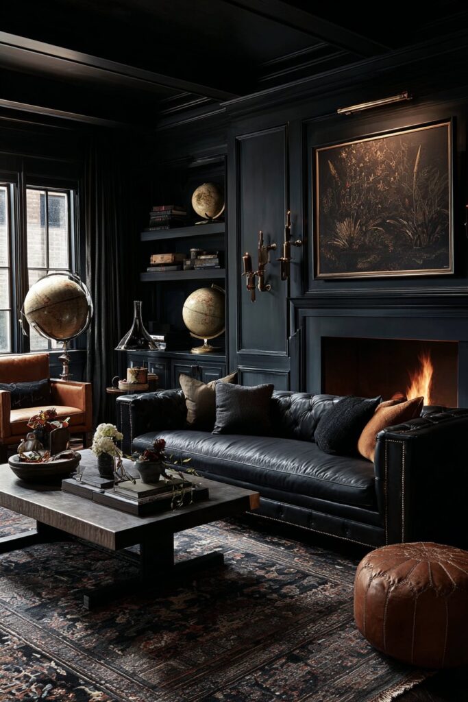
Why Dark Wallpaper Outperforms Dark Paint
Paint creates a flat, uniform surface. Even specialty finishes like limewash or venetian plaster create variation within a single color. Wallpaper introduces pattern, texture, and imagery that layers within the room’s overall atmosphere in ways paint simply cannot. In a dark living room, the impact of this distinction is amplified. A dark painted wall recedes into the background — it creates a stage. A dark wallpapered wall becomes a set piece, a story, an environment with its own internal world. The best dark wallpapers for living rooms — botanical prints on near-black grounds, geometric metallics on deep jewel tones, architectural toile on midnight navy — create rooms that feel transported to another place entirely, whether that’s a Victorian hothouse, a Moroccan riad, or a Japanese teahouse at night.
Choosing the Right Dark Pattern for Your Living Room
Scale matching is the first principle I apply when selecting dark wallpaper for living rooms. Large pattern repeats — oversized botanical fronds, expansive architectural motifs, generous geometric forms — require ceiling heights of at least 9 feet to read properly without overwhelming the space. In rooms with lower ceilings, smaller-scale patterns or tone-on-tone textures create depth without visual pressure. The color temperature of the pattern’s ground matters as much as the pattern itself: dark warm grounds — near-black with brown or red undertones — create coziness, while dark cool grounds — true black or blue-black — create drama and formality. Consider which mood suits how you actually use the room before committing.
Maximalist Versus Restrained Dark Wallpaper Approaches
Not every dark wallpapered room needs to be a riot of pattern. Some of the most beautiful dark living rooms I’ve created use deeply subtle wallpapers — embossed damasks in tonal charcoal, grasscloth in midnight navy, or textured linen weaves in near-black — where the pattern only reveals itself when you’re close enough to touch the wall. This restraint suits rooms that already contain significant visual interest in furniture, art, and accessories. More boldly patterned wallpapers — the botanical maximalists, the ornate toiles, the graphic geometrics — work best in rooms with simpler, more architectural furniture so the pattern has space to dominate without competition.
Shera’s Favourite Dark Wallpaper Combinations
My most-returned-to combination is a deep botanical wallpaper — dark navy or near-black ground, oversized tropical leaves in forest green and hunter — paired with warm amber lighting, aged brass hardware, and a single large velvet sofa in deep teal or forest green. The effect is immersive and theatrical in the best possible way. Guests walk in and audibly react. That reaction — the sharp intake of breath, the immediate reaching for a phone to photograph the room — is exactly what great dark living room design should produce. It makes people feel that they’ve entered somewhere genuinely different from any room they’ve been in before.
Layered Ambient Lighting as a Decor Element
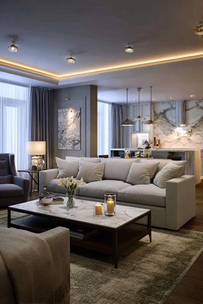
Why Layered Lighting is Non-Negotiable in Dark Spaces
A dark living room illuminated only by overhead lighting looks exactly as bad as you fear. Overhead lights in dark rooms create harsh downward shadows, make every surface look flat, and eliminate all the depth and texture that dark walls and rich fabrics are supposed to provide. The solution is layered lighting — multiple light sources at different heights, in different positions, creating overlapping pools of warm illumination that fill the room from all directions without any single source dominating. In dark living rooms, I plan for a minimum of six distinct light sources: a floor lamp, two table lamps, two wall sconces, and at least one directional accent light for art or architectural features. This sounds like a lot until you see the difference between a single overhead fixture and a fully layered room — it is, without exaggeration, the difference between two completely different spaces.
The Best Light Sources for Dark Living Rooms
Warm bulbs — 2200K to 2700K — are non-negotiable in dark living rooms. Any bulb above 3000K will cast a cool, bluish-white light that makes dark walls look drab and cold rather than rich and atmospheric. Edison-style filament bulbs visible through glass pendant shades or open sconce frames add a visual warmth of their own — the glowing filament itself becomes a design element, particularly beautiful in rooms with dark walls where the filament’s warm gold light is the only cool counterpoint. Dimmer switches on every circuit are equally non-negotiable. The ability to drop all your light sources to 30 percent of their full brightness for an evening in transforms a dark living room from comfortable to genuinely magical — a quality that fixed-brightness lighting can never approach.
Decorative Lighting as Focal Point Art
In dark living rooms, a statement pendant light or chandelier operates simultaneously as a light source and as wall-level art — its form, material, and scale become a major design element when viewed against a dark background. I’m particularly drawn to rattan and woven pendant lights in dark living rooms: the natural, warm material sits comfortably within dark palettes and casts the most beautiful patterned shadows across dark walls when lit. Dramatic crystal chandeliers in dark rooms create an extraordinary jewel-box effect — every facet catches the light and scatters it across dark walls in constantly shifting patterns. The chandeliers that look overwrought and pretentious in a pale, minimal room find their perfect context in a dark, layered space where their romance is earned by the atmosphere surrounding them.
Shera’s Lighting Checklist for Dark Living Rooms
I work through the same checklist on every dark living room project. Every seating area has a lamp within reach — no one should have to sit in a dark pocket while the rest of the room glows. Every piece of significant art has directional accent lighting. Every architectural detail worth noticing — the wainscoting, the bookshelf, the mantelpiece — has a wash of light that reveals its texture. And the entire system runs on dimmers that allow the room to shift from bright enough for reading on a winter afternoon to romantically dim for an evening with guests. Building that flexibility in from the start costs very little extra at the planning stage and delivers dividends every single evening the room is used.
Moody Maximalist Bookshelf Styling
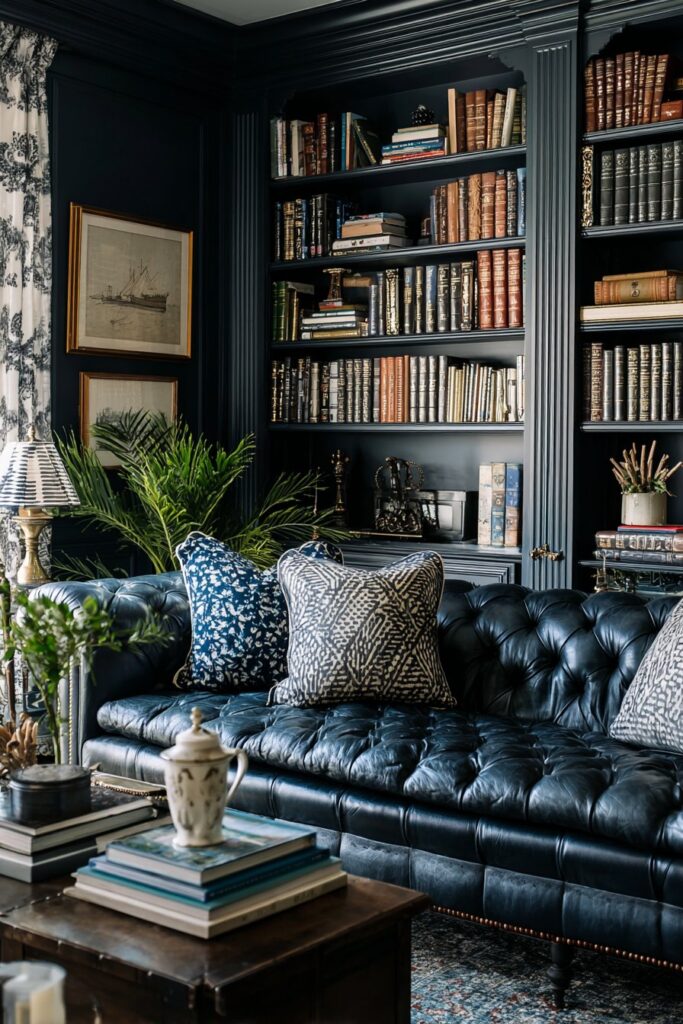
Why Bookshelves Thrive Against Dark Backgrounds
The visual logic is simple but powerful: against a pale wall, a bookshelf full of books and objects competes with the wall for visual attention. Against a dark wall, the bookshelf and its contents become the wall — the dark background recedes, and every object arranged on the shelves appears to float in atmospheric space. Spines of books that you’d barely notice against white or cream pop with color and character against dark charcoal or navy. Ceramic vessels in warm tones, brass objects, crystal decanters, framed photographs, and trailing plants all find their most flattering context against the dark-walled bookshelf backdrop. In maximalist dark living rooms, a floor-to-ceiling bookshelf styled with intention becomes the single most impactful design element in the entire space.
Styling Principles for Dark Room Bookshelves
The rules of bookshelf styling in dark rooms differ from those in light rooms in one critical respect: you need more contrast and more variety to prevent the display from disappearing into the dark surround. I mix books shelved vertically with books stacked horizontally, creating varied rhythm across each shelf level. Warm metallics — brass bookends, gilded frames, copper vessels — are distributed evenly throughout the display so the eye has warm landing points at regular intervals as it travels across the shelves. Plants are essential: a trailing pothos or string of pearls cascading from a high shelf introduces organic movement and vivid green contrast that no manufactured object can replicate. Every shelf should contain at least one object with reflective or luminous quality — a mirror, a crystal decanter, a glass vase — to catch and return the room’s warm light.
Painting Bookshelf Interiors for Extra Drama
One of the most effective techniques I use in dark living rooms is painting the back panel of a bookshelf in a contrasting deep tone. If the walls are charcoal, I paint the shelf interior in deep forest green or navy. If the walls are navy, I paint the interior in a warm dark terracotta or deep burgundy. This creates a layered effect where each shelf becomes its own framed vignette, the contrasting background adding depth to the objects arranged against it. The effect photographs beautifully and in person stops everyone who sees it the first time. It is, genuinely, one of the highest-impact, lowest-cost interventions available in dark living room design.
Shera’s Bookshelf Styling Process
I always style bookshelves in stages rather than all at once. First, I distribute the books — mixing colors, orientations, and heights across all the shelves to establish the basic rhythm. Second, I add the large anchor objects — the significant ceramics, the substantial brass pieces, the largest framed photographs. Third, I layer in the smaller objects that reward close inspection — the small sculpture, the interesting stone, the tiny framed sketch. Finally, I add plants last, using them to soften any areas that feel too rigid or too deliberately arranged. The goal is a display that looks as though it developed organically over time, even when it was assembled in an afternoon.
Deep Olive Green with Warm Earthy Neutrals
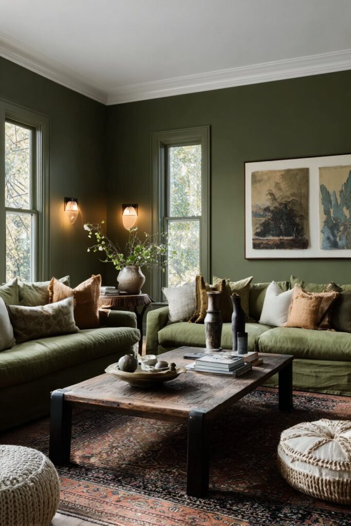
Why Olive Green Creates Uniquely Warm Dark Rooms
Olive green sits at the intersection of warm and cool — it contains enough yellow to read as warm and earthy, and enough green to read as natural and calming. In dark living rooms, this dual quality means olive walls feel simultaneously sophisticated and deeply welcoming, without the formality that navy can introduce or the intensity that burgundy brings. Olive is also extraordinarily forgiving of natural light variation — in rooms that shift between bright morning light and dim evening lamplight, olive green looks beautiful at both extremes, changing character with the light rather than appearing different and problematic. In morning light it reads as a warm, earthy sage. By evening under warm lamps it deepens to a rich, dark khaki that is genuinely stunning.
Combining Olive with Earthy Neutrals
The natural palette partners for deep olive green are all warm and organic: raw linen, undyed wool, aged leather, washed cotton canvas, and warm-toned timber. These materials share olive’s earthy, slightly weathered character and create a room that feels as though its entire palette grew from the same soil. Cream and off-white rather than stark white work best as the room’s lightest tones — stark white against olive can look clinical and cold, while warm cream creates a gentle contrast that feels natural and considered. Terracotta introduced through ceramics, cushions, or a single painted accent piece bridges beautifully between olive walls and warm wooden floors or furniture.
Metallics and Accents That Elevate Olive Rooms
Olive green’s warm undertones make it one of the most flattering backdrops for antique brass and aged bronze — the metals appear even warmer and more luminous against olive than they do against cooler greens. I avoid silver and chrome in olive rooms entirely, as cool metals create a jarring note in what should be an entirely warm, organic palette. Burnished copper is a particularly beautiful choice — its reddish warmth complements olive’s yellow undertones in a way that feels like a collaboration between colors that genuinely belong together. For textiles, rust, burnt orange, warm mustard, and deep cinnamon all work beautifully with olive walls, building a palette that feels rich, warm, and entirely coherent.
Shera’s Favourite Olive Room Schemes
My most successful olive living room to date combined deep khaki olive walls with a sofa in aged tan leather, a large Persian rug in faded reds and golds, brass floor lamp, linen curtains in warm oatmeal, and a collection of hand-thrown ceramics in terracotta and cream on floating shelves painted the same olive as the walls. The room felt simultaneously like a Provençal farmhouse, a Kyoto tearoom, and a genuinely contemporary family home — which sounds impossible but is exactly the kind of timeless-yet-current feeling that the best dark living rooms achieve when their palette is chosen with real care.
Black Fireplace Surround as Focal Point
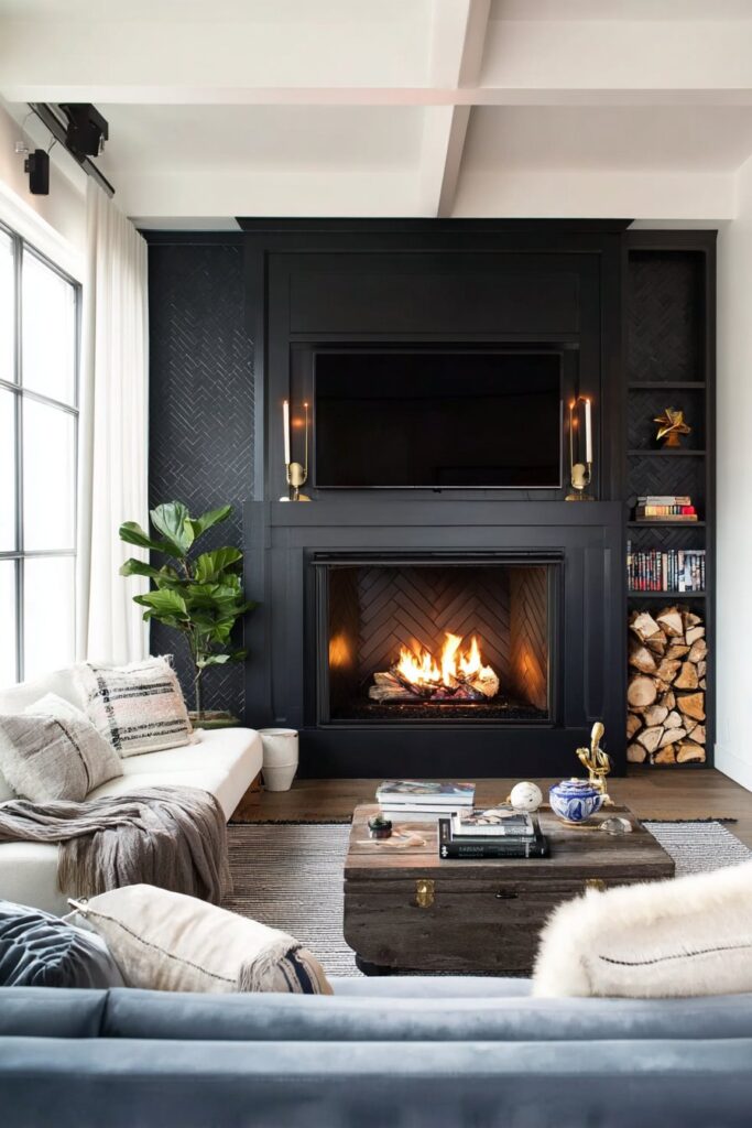
Why a Dark Fireplace Commands the Room
The conventional approach — a pale marble or white-painted fireplace surround in a room of any color — works by contrast. The fireplace stands out because it is lighter than its surroundings. In a dark living room, this approach introduces an awkward visual tension: the pale surround fights the dark walls for dominance rather than collaborating with the room’s palette. A dark fireplace surround resolves this tension by unifying the architectural element with the room’s overall color story while simultaneously amplifying the drama of the fire itself. When a fire burns in a blackened or deep-painted surround set within dark walls, the effect is one of the most beautiful things interior design can produce — warm, flickering light set within layer upon layer of rich, dark depth.
Choosing Materials and Finishes for Dark Fireplace Surrounds
Matte black cast iron is the most traditional choice and remains one of the most beautiful — original Victorian and Edwardian cast iron fireplaces, when restored and polished, create surrounds of extraordinary refinement. For more contemporary spaces, honed black slate or dark limestone creates a surround with sophisticated material depth. Painted surrounds — in deep charcoal, near-black, or the same dark tone as the walls — create a seamless architectural integration where the fireplace reads as part of the wall rather than an insertion into it. This seamless approach works particularly well in minimalist dark rooms where the fire itself, rather than an elaborate surround, should be the dominant visual element.
Styling the Fireplace Wall in Dark Rooms
The mantelpiece display above a dark fireplace surround should be intentional and relatively restrained — the fireplace itself is so visually powerful that it needs space around it rather than competition above it. I typically style dark fireplace mantels with one significant central object — a large mirror, a piece of art, or a singular sculptural vessel — flanked by two smaller groupings that balance the composition without cluttering it. Candles on the mantel are particularly beautiful in dark rooms, their warm flickering light adding to the ambient glow and creating a visual connection between the lit fire below and the candlelight above.
Shera’s Dark Fireplace Success Stories
A client last winter had a Victorian fireplace that had been boxed over in the 1980s. We uncovered the original cast iron surround, restored it, painted the fireback matte black, and surrounded it with walls in deep charcoal. The transformation was so dramatic that she told me the room went from the space she used least in the house to the room she never wanted to leave. That shift — from avoided room to beloved sanctuary — is exactly what a thoughtfully executed dark fireplace focal point can achieve, and it never stops feeling like magic when it works.
Velvet and Luxurious Textile Layering
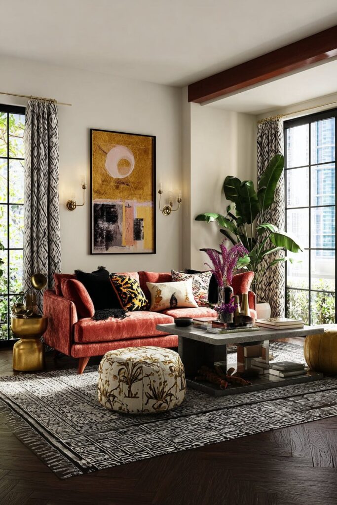
The final idea brings together all the warmth, texture, and sensory richness that makes a dark living room a genuinely cozy place to inhabit rather than simply a beautiful room to look at from the doorway. Velvet and layered textiles are the difference between a dark living room that photographs brilliantly and one that actually makes you want to sink into it and stay for the rest of the evening.
Why Velvet Is the Perfect Dark Room Fabric
Velvet’s unique pile construction means it changes color and luminosity depending on the direction from which you’re viewing it — one angle catches the light and appears vivid, the other absorbs it and appears rich and deep. In dark living rooms where light conditions shift constantly between lamplight from different directions, velvet creates a dynamic, living presence that flat fabrics cannot match. A deep teal velvet sofa against charcoal walls doesn’t look like one color — it looks like ten colors simultaneously, each seen differently from each seat in the room. This perceptual richness is what makes velvet so irreplaceable in dark room design. Forest green, midnight navy, cognac, and dusty rose are the velvet colors I return to most frequently — all of them appear at their most saturated and beautiful against dark backgrounds.
Layering Textiles for Genuine Sensory Coziness
True coziness in a dark living room is tactile as much as visual. A room that looks warm in photographs but contains only smooth, cool-to-touch surfaces — leather, glass, polished metal — will feel cold and uninviting to inhabit. Genuine warmth requires layers of different materials at different scales: a chunky wool throw draped over a velvet sofa arm, a deep-pile rug underfoot, linen cushion covers mixed with velvet ones, a cashmere blanket folded within reach of every seat. Each material should invite touch — and when guests reach out and feel the quality and warmth of the textiles in a dark living room, the room shifts from visually impressive to genuinely, deeply comfortable.
Rugs as the Foundation of Dark Room Warmth
In dark living rooms, the rug is the element that most powerfully determines how warm or cold the space feels underfoot and visually. I always recommend going larger than you think necessary — a rug that defines the entire seating area, with all four legs of every sofa and chair sitting on its surface, creates a unified, grounded composition that makes the room feel anchored and intentional. In dark rooms, Persian and Turkish rugs in faded reds, golds, and midnight blues are my perennial recommendation: their warm, rich palettes complement dark walls beautifully, and the irreplaceable character of a genuinely old rug brings historical depth that new rugs never quite achieve, regardless of their quality.
Shera’s Textile Layering Formula
My formula for textile layering in dark living rooms is straightforward: choose a dominant fabric for the largest upholstered piece (usually velvet), a secondary texture for cushion covers and throws (linen, wool, or cashmere), and a rug material that unifies both (jute, wool, or silk-blend Persian). Within this framework, vary the color values — some textiles in the exact shade of the walls for tonal depth, some in a warm contrasting tone for visual interest, and some in near-neutral cream or oatmeal for breathing room. The result is a room that looks as good as it feels — and more importantly, a room that people walk into and immediately, instinctively, want to stay in.
Conclusion
I’ve shown you that a cozy dark living room isn’t an accident or a bold gamble — it’s a deliberate, layered decision built from fifteen specific choices that work together to create something genuinely extraordinary. From the enveloping warmth of deep navy and warm brass, to the earthiness of terracotta and olive, to the sensory richness of velvet and layered textiles, each of these ideas shares a common principle: work with the darkness rather than against it. Every choice — the warm-toned lighting, the gilded mirror, the dark fireplace surround, the maximalist bookshelf — gains beauty and meaning from the dark context that surrounds it.
You don’t need to implement all fifteen ideas at once. In fact, the best dark living rooms are built gradually — one decision at a time, each choice deepening and enriching what came before it. Begin with the wall color that speaks to you most immediately. Add lighting next, because nothing else you do matters as much as getting warm, layered illumination right. Then bring in textiles, art, and accessories in stages, allowing the room to reveal what it needs at each step rather than forcing a complete vision all at once.
The instinct to brighten dark rooms — to add mirrors that flood them with light, to paint walls white, to fight the darkness at every turn — comes from a fear that dark spaces will feel oppressive or uninviting. What fifteen years of designing and living in dark rooms has taught me is the exact opposite. Done with intention, a dark living room is the most welcoming, most comfortable, most genuinely cozy space a home can contain. It wraps you in warmth and atmosphere the moment you enter it, and it never stops feeling like the best room in the house. Trust the darkness, layer it with warmth, and it will give you everything back.